|
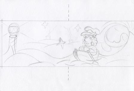
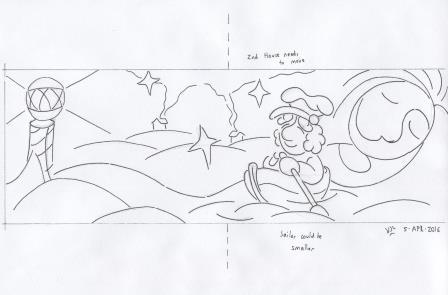
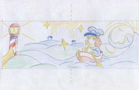
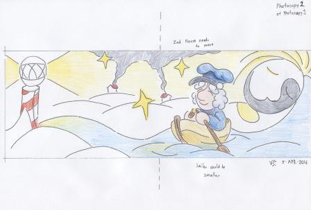
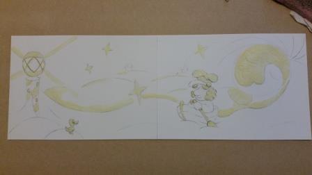
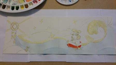
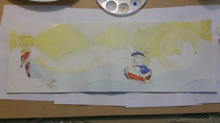
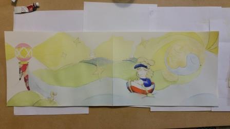
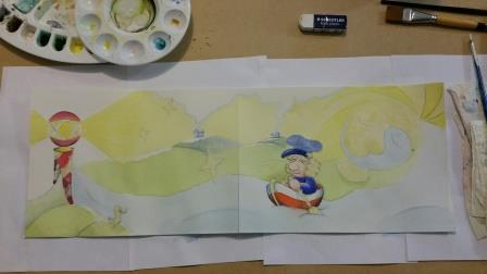
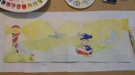
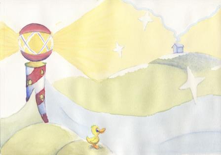
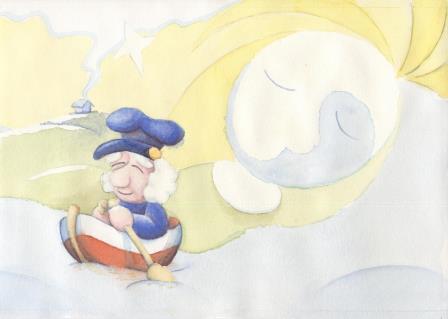
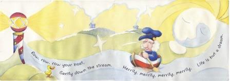
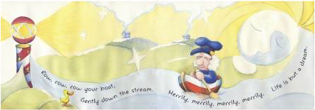
Since January I have been working through the London Art College's correspondence course D6 Illustrating Children's Books, and I am just about ready to submit my first artworks for assessment. For each assessment, 2 artworks are submitted. This second one was the bigger project. The brief was to prepare a double page spread (equivalent of 2 landscape sheets of A4 with a 5mm bleed allowance) containing the text to the nursery rhyme 'Row Your Boat'. The text had to go along the bottom of the two pages, and to have a pale background. The artwork had to be simple and bold, and suitable for a 2-4 year old child and for the adult reading the story. It had to be dreamlike, but without being scary or nightmarish. Any characters, human or animal, have to be engaging to a small child. Firstly I sketched an idea or two into my visual diary, to see if it would work. Then I re-drew it in pencil, with modifications, onto 1/4 size to get the layout and spacing going in the right direction: Then I inked that sketch, and added a few notes to myself as reminders for when I drew the full size picture. The next step was to photocopy the drawings and to test some colour ideas with coloured pencils, and also whether I should use ink or not on the final artwork. I decided against the ink, thinking it would detract from the dreamlike quality desired. Here's the full size artwork, after the masking fluid had been applied. The little duck is new, and the gutter area is now free of important elements. Now for some initial colour washes. Some work on the background, the pole that doubles as both bed-post and lighthouse, and a bit more work on the rower. Time for some work on the middle-ground: Now for skin tone on the rower, the blue houses and more work on the bed-post/lighthouse: Here the little duck now has some colour, and it is almost time to remove the masking fluid, and start the flattening process: Here's the raw scan of the left hand page And the raw scan of the right hand page From here a lot of work went into fixing up minor blemishes in Photoshop and merging the join together. Then the artwork went into InDesign to add the text, the font Angillian regular seemed to be just right. Here's the final artwork with the bleed still showing: And as it might look in a finished book without the bleed. I'm more comfortable working at A4 size, so this project was a bit outside my comfort zone. Thinking about a pre-school audience was outside my comfort zone too. Now that this project is finished I'm looking forward to the next segment of the course.
0 Comments
Your comment will be posted after it is approved.
Leave a Reply. |
News and Other StuffAbout recent artwork, inspirations and other things I find interesting. Archives
June 2024
Categories
All
|
All artwork and images on this website (unless stated otherwise) are the property of Vincent Cavanagh and cannot be used without his permission.
|
Social Links
|
Powered by Weebly
|

 RSS Feed