|
Here it is.....the final sixth set of artworks for assessment to the London Art College's correspondence course D6 Illustrating Children's Books. Hooray! Of the set, the second part is a bigger project, which this time had to be done as a double page spread on an A3 page with both a bleed 5mm and a slug area 50mm, which ends up with a single page measuring 180mm tall and 150mm wide. The brief went something like this: Illustrate a double page spread from a story book aimed at 3 to 5 year olds called 'Moving House'. This will be the last page where your chosen character (human or animal) at last finds just the right home. The story is about this character's difficulties in finding a good place to move into. The text, 'At last, just the right home, now he no longer has to roam' will run along the bottom of the page. Unsurprisingly, due to a furry creature who recently decided that our home was just the right place, and our efforts to dissuade said creature, the character was a possum. Here are my initial ideas, which had to be scrapped once I re-read the brief and couldn't use a diagonal for the text. 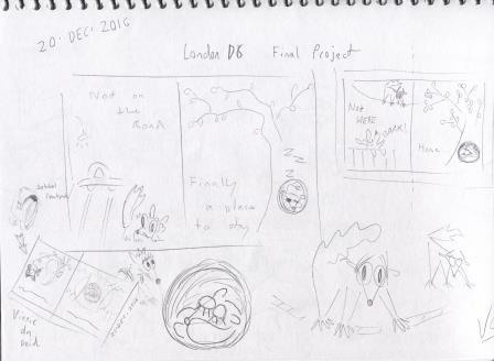 I got as far as inking the next idea, before eventually agreeing that it wasn't really working. (The next few images are from photographs.) 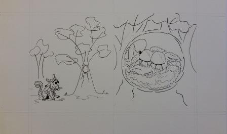 Yet another idea got scapped. Sorry, this one only got as far as pencil stage, so it is more difficult to see. There are blueprints and a backpack on the left of the tree, and on the other side of that tree is the possum with a pencil behind his ear sizing up the dimensions of the tree and giving it a mental tick. Then we have a contented sleeping possum in that tree hollow. Why did it get scapped? It was working better, but still hadn't nailed it - and it was pointed out that when a double page spead is requested, a diptych is unlikely to satisfy the brief especially when it is for the final double page spread. Back to the drawing board.... 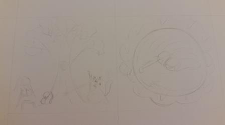 Was all this anguish worth it? I think so. Now we have the possum showing the joy and excitement that was missing from previous drafts, and the new home has passed several more tests. 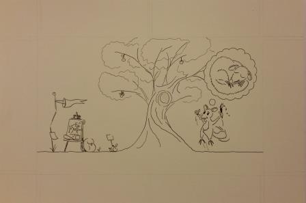 Now to start adding the colour, and begin bringing it to life... 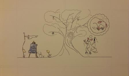 Finishing the watercolour on the possums came next. 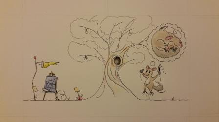 And then the tree, the fruit, the backpack and the all important red ticks. 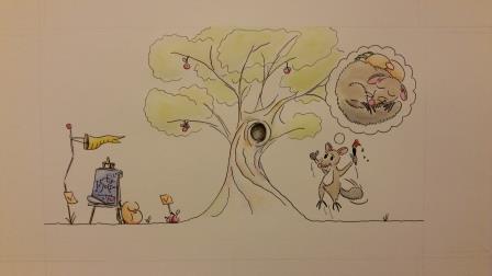 When the watercolour work was finished, an A3 scan was required and that wasn't easy during the Christmas/NewYear period where commercial scanners were offline. For such delicate colours, a commercial quality scan was essential. Then some Photoshop clean up was required, a little colour management, and hightlighting the bleed and crop marks, because when you have to further adjust to 1500 pixels wide to submit the project they tend to become close to invisible. 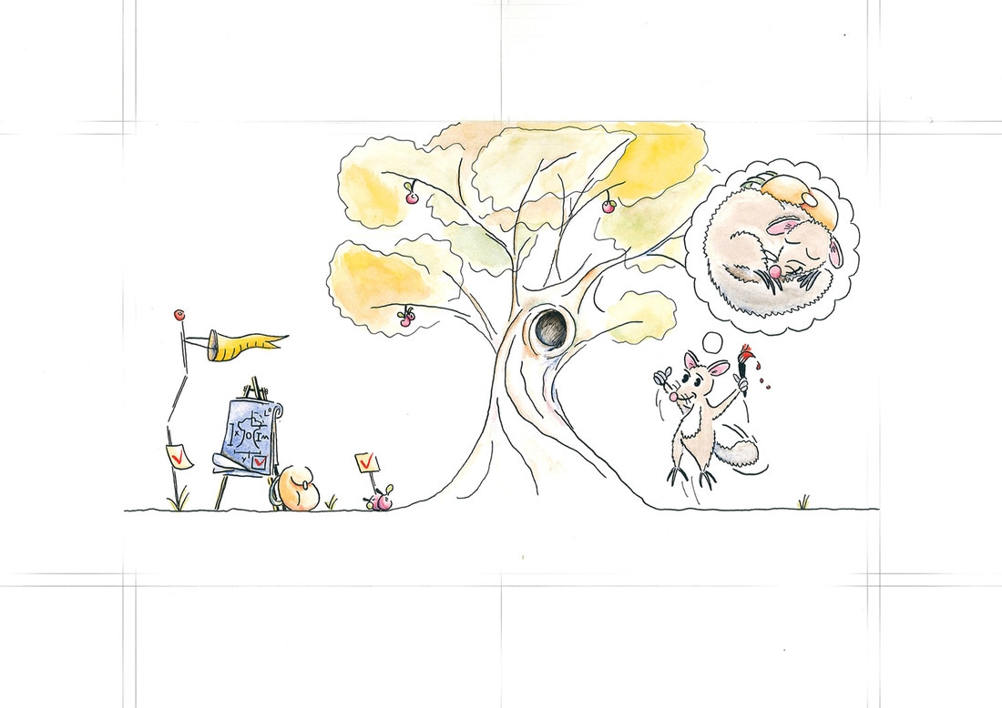 Now to add in the given text, and remove the slug, to show what the final art would look like. 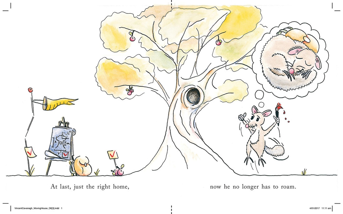 With this artwork, the course work for the Diploma in Illustrating Children's Books with the London Art College is complete. The coursework was mailed from London on 12 Jan 2016 and arrived a week or so later, so I am very pleased to have completed it within the 12 month window.
What now? That's a very good question. I'm sending out resumes, and illustration portfolios, hoping for paid employment or an illustration agent - or both. I will also be looking into further studies (perhaps something different like barrista training maybe) and want to give the 52 Week Illustration Challenge a go this year. The best way to find out what happens next is to sign up for my email newsletter, it has been going for 4 years and the 33rd issue is due mid January 2017.
0 Comments
The end is in sight. This is the sixth and final set of artworks for assessment to the London Art College's correspondence course D6 Illustrating Children's Books. Of the set, the first part is a smaller project, which was an exercise in faces and shapes. The brief went something like this: Draw a series of rough geometic shapes: a circle, an oval, an up pointing triangle, a down pointing triangle, a square, a rectangle and a long U shape. Create faces from these shapes. Use exaggerated expressions. Experiment with colour, materials and types of line. To get the experimentation right, I wrote out a list of methods. Nib ink with minimum detail Pen ink with more detail Nib ink with watercolour Pen ink with watercolour Ink with coloured pencil Watercolour first, ink last Watercolour and pencil, with no ink Then the fun started pairing up shape with method. Here's the first page 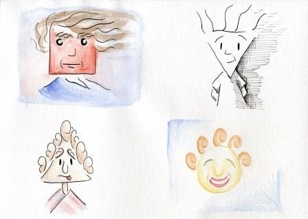 And the second page 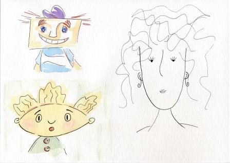 Yes, this exercise was fun indeed. One more exercise to go....
Continuing the fifth set of artworks for assessment to the London Art College's correspondence course D6 Illustrating Children's Books: Of the set, the second part is a much bigger project, which was also exercise in black and white work, to be inspired by the text of a creepy poem. The brief went something like this: The image should be suitable for 5-7 year olds. Make it portrait orientation. The given poem should be in the centre, with the illustration forming a border around it. Give it a white border, no bleed, and use 18cm wide and 25cm tall, with the poem to sit in an area of 8cm wide and 14cm tall. Balancing the black and white is important, as is creating a creepy feeling. Use the images evoked by the text, but don't be limited to them. The first part was getting the layout right, and that meant using InDesign and doing some research on how to display a poem where the first line is also the title. Accordingly the first line was in bold with a stanza-sized gap to the second line. Then I needed to try out some ideas for the illustrated border. So I printed out a few templates and started sketching. With the first one I tried for a Phantom of the Opera style character, but ditched that idea. 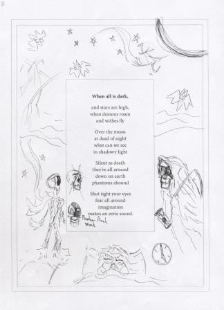 The outer parallel line shows the trimmed paper size and the inner parallel line shows the white border. The next sketch developed the grim reaper and the moon further. 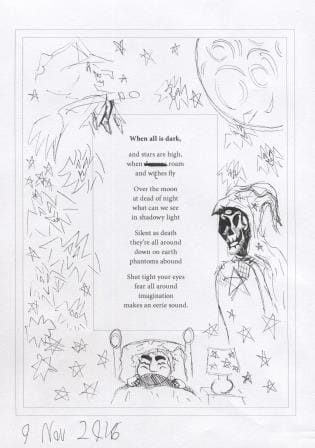 Too many bats didn't create enough interest, so I looked into ghostly options and refined the witch a bit. 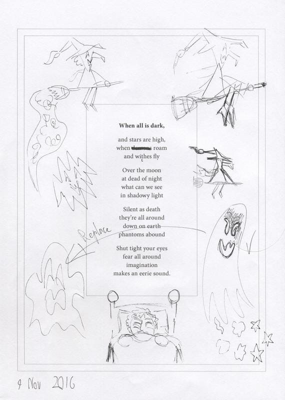 Now to get out the good paper and begin: This is how it looked around halfway through. Again I needed to use nib ink to get the black as consistent as possible. 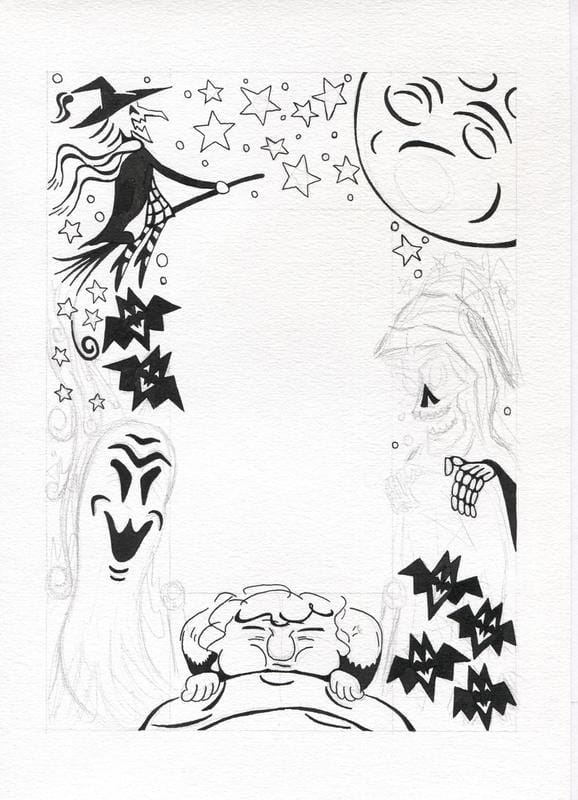 And here's what the illustration border looked like before it got cleaned up in Photoshop: Getting the balance of white and black required more work on the stars at the top of the page. 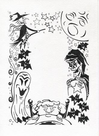 And what it looked like after the Photoshop work: I've added a hairline border using the blog tools, so that you can see that there is a few mm of white border between the illustration and edge of the trimmed page. It is easiest to see under the boy and beside the grim reaper. 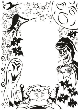 And now to add in the pre-prepared text, without the spelling mistakes. 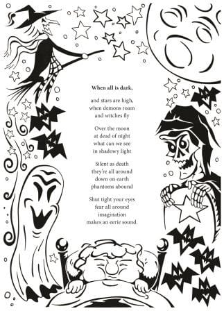 The thin white border is still there, it is just hard to see on a white background.
Creepy work like this rarely features in my visual diary! With Unit 5 done, it is time to start working on the 6th and final set of projects for this course. Now for the fifth set of artworks for assessment to the London Art College's correspondence course D6 Illustrating Children's Books. Of the set, the first part is a smaller project, which was an exercise in black and white work, with a creepy Halloween vibe. The brief went something like this: Take a vertical sheet of A4 paper and leave the middle third of it blank. On the left hand side use more white on black and on the right hand side use more black on white. Shapes on each side should complement but not repeat each other, because this is to be an illustration foremost and not a pattern. Everything starts with a sketch. So here is the initial idea in pencil. 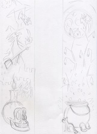 That idea got refined a bit, and tested to see how it would go 'black and white' wise with black watercolour. 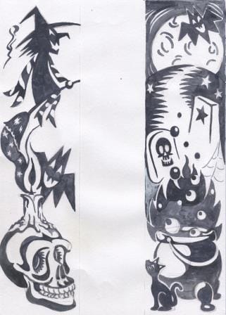 Trying to work white on black, and then black on white, is guaranteed to make your head spin. I wasn't happy with how some of the elements were working together, so I did another test page to see if I could make the witch's scarf and broom better on one side and the cauldron on the other side. From these tests, it was clear that in order to get consistent black and white contrast, I was going to need to use nib ink. 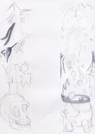 It was now time to start the final art. Here is the initial pencil stage. 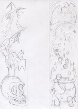 And how it looked after the nib ink was done. It was going to have to go into Photoshop to clean out the pencil marks, and to adjust the area where the candle flame and the broom exhaust meet, and to add whiskers to the cat. 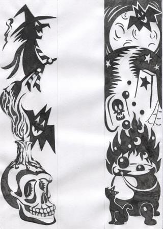 The whole Photoshop cleaning process took longer than doing the slow nib ink work, but it was well worth doing to get this result. 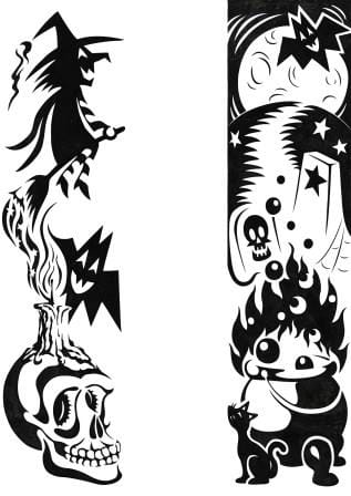 This was a challenging exercise to do. I enjoyed the challenge, but I'd have to have either a really clear idea or simpler shapes to consider doing something similar in the future.
I am still on the down hill run for submitting the fourth set of artworks for assessment to the London Art College's correspondence course D6 Illustrating Children's Books. Of the set, the second part is a bigger project, which this time had to be bigger than A4 but no bigger than 40cm x 33cm, and landscape in orientation. The brief went something like this: Illustrate a single page spread from a gentle story about a cow who finally finds friendship with a bird. The story reveals what they learn and see of the world around them as they travel. Allow 1/4 of the page as a text area, and a bleed all round. The image has to be appealing, yet delicate, and in soft colours. Good contrasts of scale between bird and cow were recommended. The following was my first concept drawing, but it got discarded because it was too similar to what other students have done. 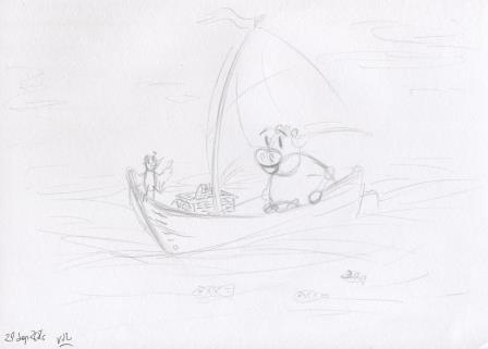 Then I did some roughs of the cow 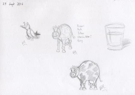 And played around with ideas for the bird 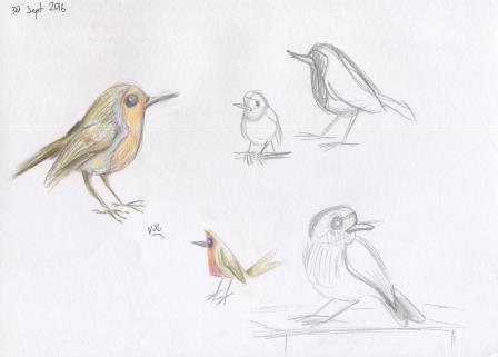 And then did a concept drawing I was happier with. I wanted to show the cow and bird relating to each other co-operatively. 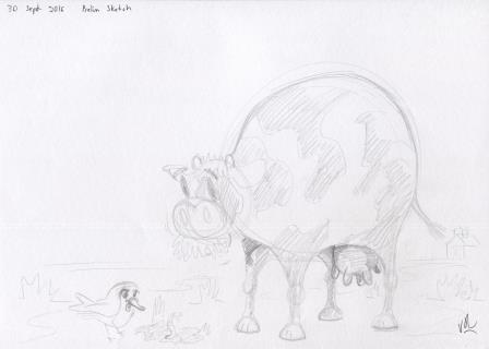 It was suggested to me that there would be more sense of travel if they were both facing the same direction. So I took that on board. From here on in, it is photographs because the A3 scanner does not do delicate colours well at all. 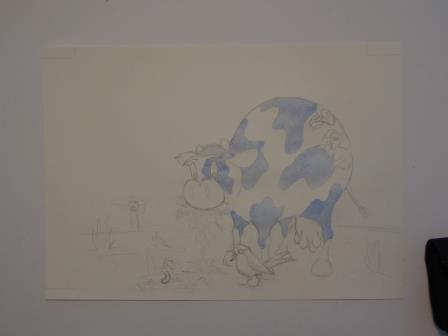 I went for a blue and white cow because I thought that black or dark would deaden the outcome, and blue and white are symbolic of milk if the average milk carton is anything to go by. 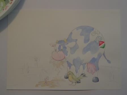 The plan was to do light initial washes with watercolour, and then add texture and softness with coloured pencil. 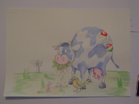 This is where the watercolour washes end, and the coloured pencil work starts 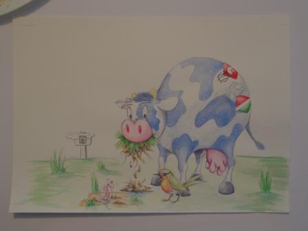 All the changes get very subtle here 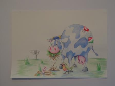 Now for a good quality scan from our local office supplies store 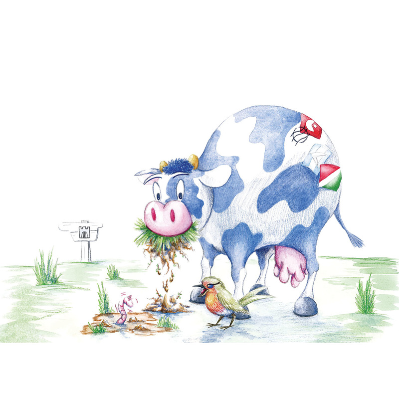 And then firstly to Photoshop for some clean-up of pencil marks and other things, and then to InDesign to add some original text. Here's how it ended up after all of that. Firstly with crop marks etc 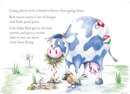 And then without crop marks 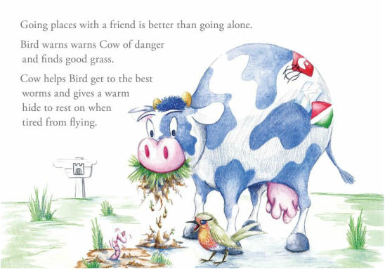 It is nice to have this one completed.
I am on the down hill run now for submitting the fourth set of artworks for assessment to the London Art College's correspondence course D6 Illustrating Children's Books. Of the set, the first part is a smaller project, which was an exercise in getting comfortable with drawing an animal in many different poses. The brief went something like this: Take a real animal and do several drawings of that animal walking around. Then start experimenting with ways of moving that this animal normally can't do, eg dancing. Put one of these animals on an A4 page, keeping it lively and well placed and add a bird. The animals should complement each other somehow. Keep the background white except for a hint of cloud, grass etc. Use soft colours and experiment with texture, but make sure the elements cohere together. I started off looking at horses mainly, with a turtle thrown in. 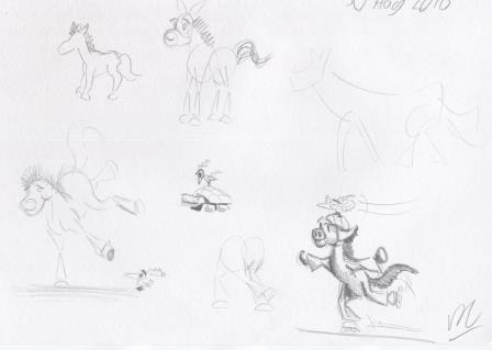 As you can see, some fun was had in this experimental stage. 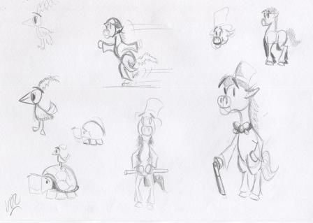 But I gave up on the horse, and became more serious about the turtle. The following sketches had inspiration from photographs of turtles I found online. 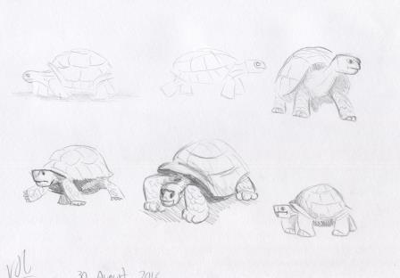 Then I played around with turtle ideas. 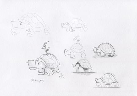 This is the pencil outline I came up with, to begin building the final artwork. 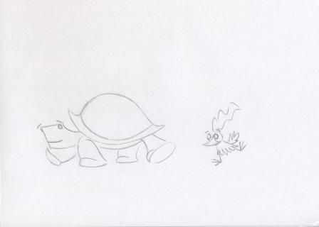 When I photocopied it, and got the coloured pencils out to do a colour test - and to some extent a texture test, it got thumbs up from the family. 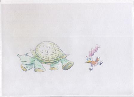 The plan I had was to do some light watercolour washes, and then add coloured pencil. 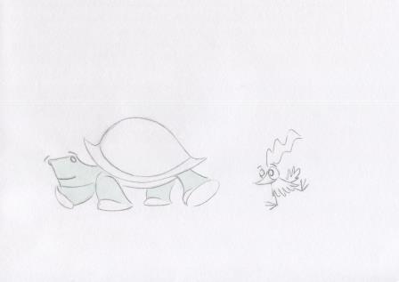 The paper buckled more than I thought it would, but I knew Photoshop could take care of that. 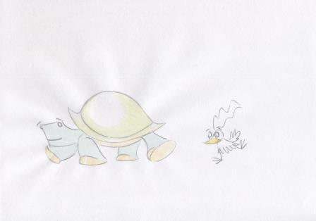 Here's how it looked with the watercolour before adding the coloured pencil work. 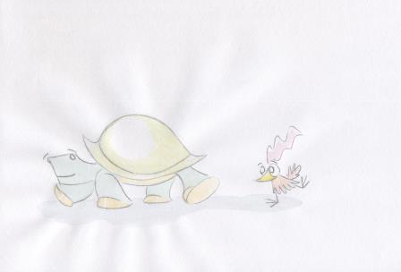 This image is about halfway through the coloured pencil work. 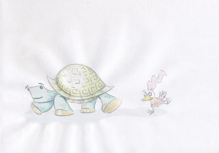 And this is as far as I went with the coloured pencils, before scanning it onto the computer to complete it. 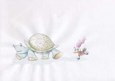 And here's my turtle and bird, finished. 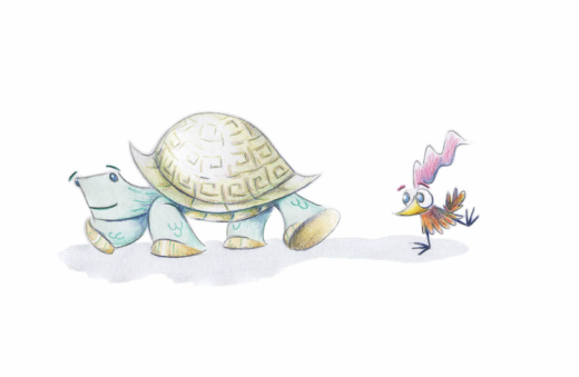 It is a long way from the horses I started with, but I'm happy with it.
I am closer to submitting the third set of artworks for assessment to the London Art College's correspondence course D6 Illustrating Children's Books. Of the set, the second part is a bigger project, is a vignette of a young dragon who has yet to control his fiery breath. The brief went something like this: Capture Fred's look of baffled horror as he sets fire to a thatched cottage roof. Audience is for fairly young children, but will also appeal to older children if enough humour is present. Use very bright colours, loose paint work, and thick black line work. Use portrait orientation and despite the chaos make it easy for a child to decode what is happening in the illustration. So the first step was a few practice sketches to work out what Fred should look like: 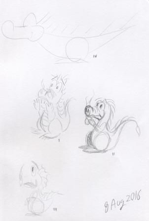 And a practice go at the composition of the image, especially the relationship between the dragon and the cottage: 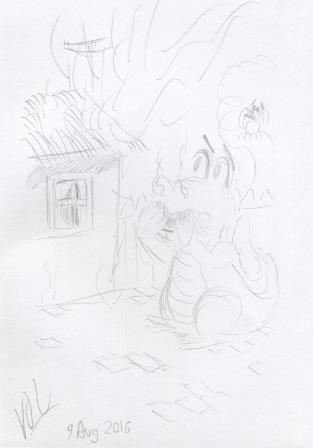 Here is the pencil outline for the vignette: 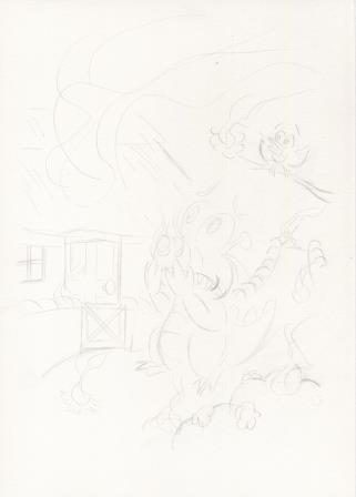 And some of the initial washes, starting with our friend Fred: 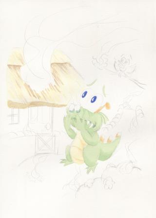 Some more washes along, and the vignette shape can be seen, and the background is taking shape: 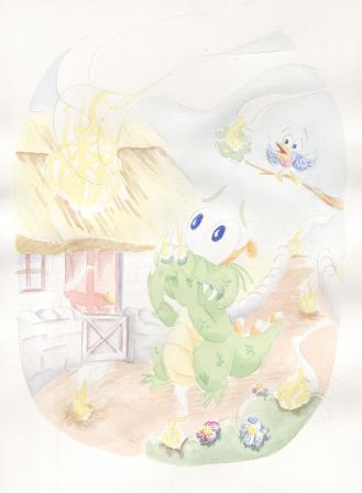 Now to add in some more layers of colour and to intensify the fires poor Fred has lit: 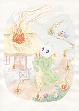 The next thing is to add the thick soft pencil, while somehow keeping it both loose and bold: 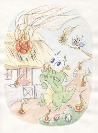 The last step is doing some clean-up with Photoshop: 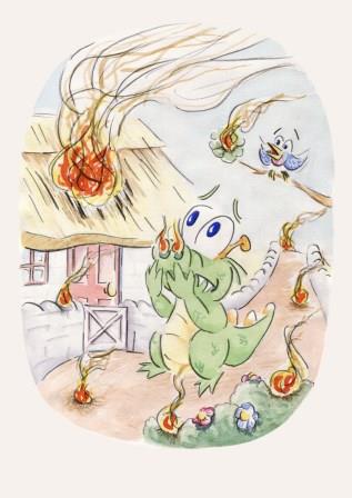 And Fiery Fred is done. Just like the first part of this unit, using this method of building up a picture is well outside my comfort zone. I'm far more comfortable using pen ink for the backbone of the image instead of watercolour.
I am getting close to submitting the third set of artworks for assessment to the London Art College's correspondence course D6 Illustrating Children's Books. Of the set, the first part is a smaller project, outline drawings of animals doing silly things. The brief went something like this: Make 3 or 4 loose bold outline drawings of animals doing silly things. Use bold and simple shapes. Draw with thick, soft pencil or crayon, and use a different primary colour for each animal. Add a contrasting colour for interest. When dry add more line detail. Keep your audience of young children in mind. This exercise was well outside my comfort zone, because I love using close ink detail and loose work does not come naturally. Here are the initial ideas I had, in my usual style: 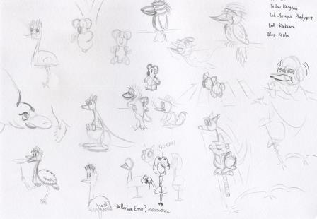 I had to go much larger, and with thicker pencil. You can see here my pencil tests and the development of the horse, kangaroo and kookaburra ideas. 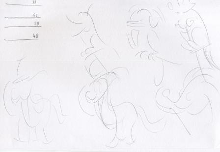 The next sketches explore the dancing bird and the kookaburra further: 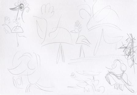 And some more ideas, with the emu, kangaroo, horse, echidna and kookaburra. 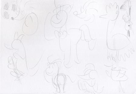 The next step was to give it a go on good cartridge paper. Here's a progress scan. We have the horse with the top hat, (blue with orange contrast); the dancing bird/emu, (yellow with purple contrast) and the kookaburra listening to music (red with green contrast). 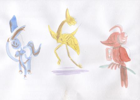 Now to add the extra pencil detail. 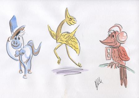 I didn't want to go further and ruin them, so I decided not to redo them on heavier paper. But I did try to clean them up with Photoshop. 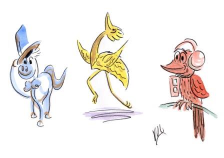 I think I am happy with the final result. The more I look at them, the happier I get. So I decided to explore the thick pencil style a bit further and used it for my Father's Day picture. Firstly, here's the pencil sketch:  And trying 'to keep it loose', here's the first wash. 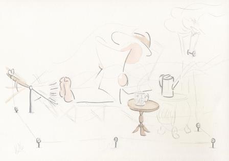 Another set of washes, and the image will get clearer: 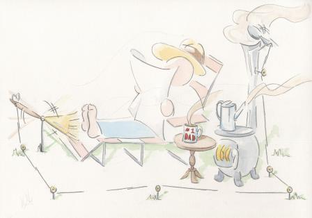 And adding in some more line work, and a bit more colour detail: 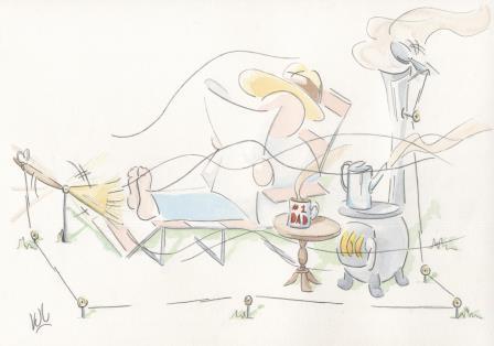 With the final touches in Photoshop, it is now ready to go on this year's batch of Father's Day cards. 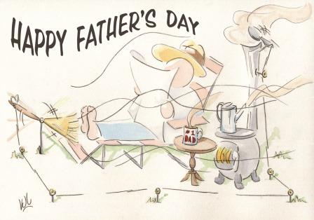 So all in all, a very interesting exercise/project, despite all my initial misgivings.
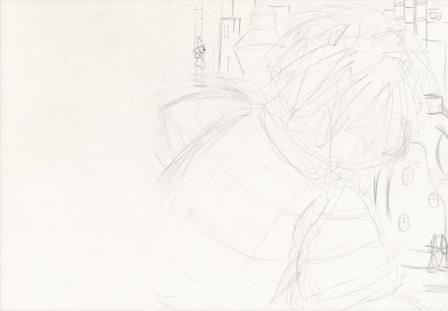
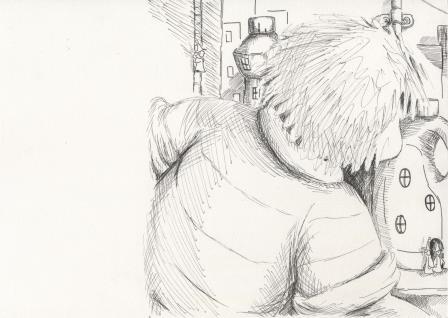
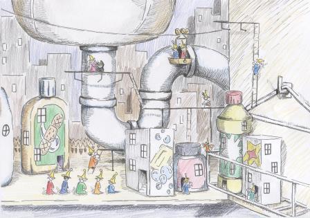
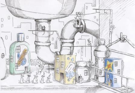
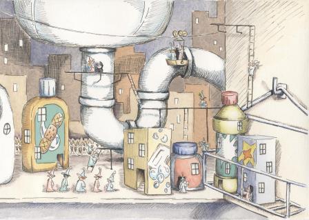
I am just about ready to submit the second set of artworks for assessment to the London Art College's correspondence course D6 Illustrating Children's Books. Of the set, the second part is a major project, a double page spread. The brief went something like this: Allow for a text area taking up about 1/3 of the left hand page. Sebastian is seen to either build or find an imaginary world under the kitchen sink. Make it detailed with a cartoony edge, and use good contrasts of scale. Allow a 30mm border between the trimmed edge of the page and the start of the text. The text was not supplied. Here's the layout idea from my sketchbook: 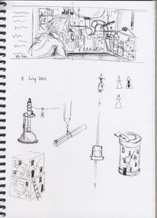 And my pencil roughs:
The next part was to add the ink.
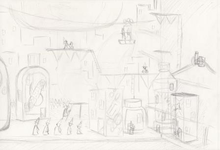
And then add a bit more ink, increasing the lights and darks and adding more detail.
Next I took some photocopies, and used coloured pencils to test my colour arrangement ideas.
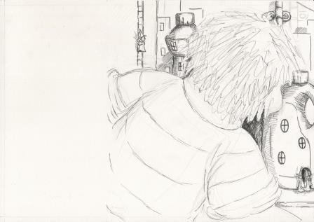
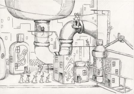
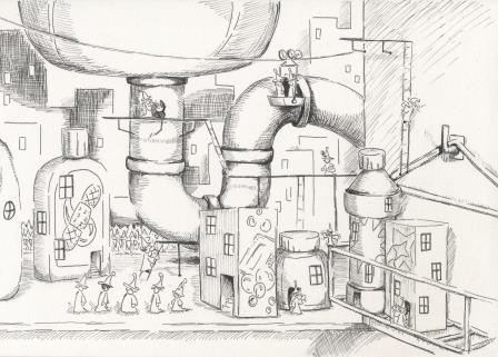
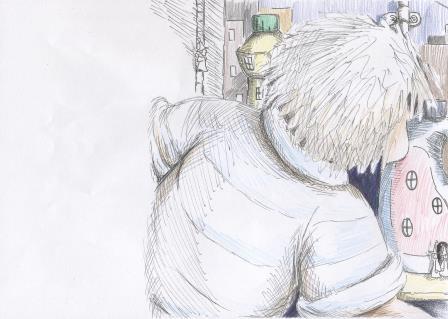
It seemed like having minimum colour on Sebastian made for a better flow from text area to city, and made the city the feature of the double page spread. Now to begin the watercolour work. Masking fluid first. For this part it was easier to take photos rather than scans. I started with the browns and beiges. 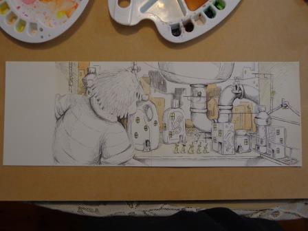 Then came some blues and greens. 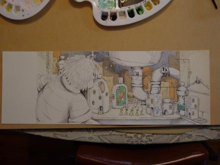 Followed by yellows and reds. 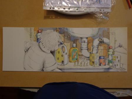 Then some skin tones on Sebastian, and fine tonal detail. The little people still need colour. 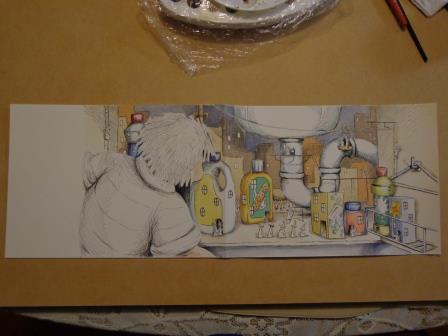 Here's the final raw artwork, with the bleed area still present.
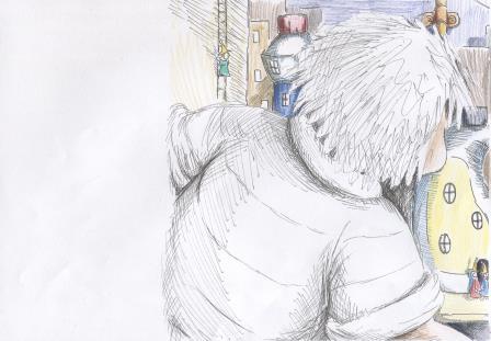
Now to stitch it together with Photoshop and remove a few minor blemishes. 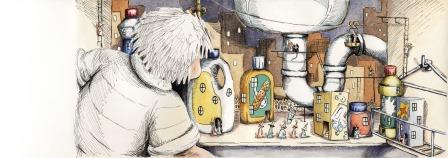 And what it would look like with the 5mm bleed removed, in a picture book. 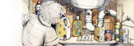 And lastly, how a bit of text would look. 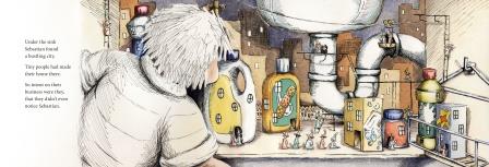 I'm very pleased that this project is finished. I enjoyed it, but it took a lot of work to complete.
I am just about ready to submit the second set of artworks for assessment to the London Art College's correspondence course D6 Illustrating Children's Books. The first part of each set is smaller and easier, and the second one is a major project. This time the smaller part of the project was about contrast in scale, ink work, texture and lighting. For this one the brief was very detailed. I needed to think about some kind of household cleaning product's bottle and imagine it as a building. Next to the building a small creature was needed (person or animal or alien)/ that would intrigue and engage a child but not frighten them. Lighting had to come in from one side, black ink was the medium to be used, and texture had to be used to both differentiate and unite both objects on the A4 page. Firstly we had to work-up some roughs, and so experiment with the ideas we had. Here's my sketchbook page: 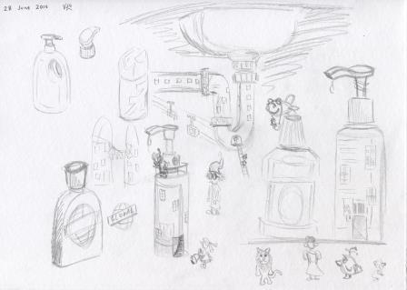 The bottle to the far right and the bird-like creature under it became the raw ideas for the final artwork. Here it is in its needing to be cleaned state: 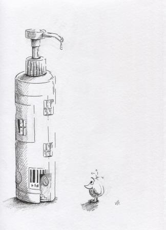 And what the final work looked like after it was cleaned up a bit, with the underlying pencil marks removed: 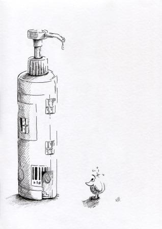 I love doing this kind of ink work, and it proved to be very good preparation for the second (major) part of the project.
|
News and Other StuffAbout recent artwork, inspirations and other things I find interesting. Archives
July 2024
Categories
All
|
 RSS Feed
All artwork and images on this website (unless stated otherwise) are the property of Vincent Cavanagh and cannot be used without his permission.
|
Social Links
|
Powered by Weebly
|