|
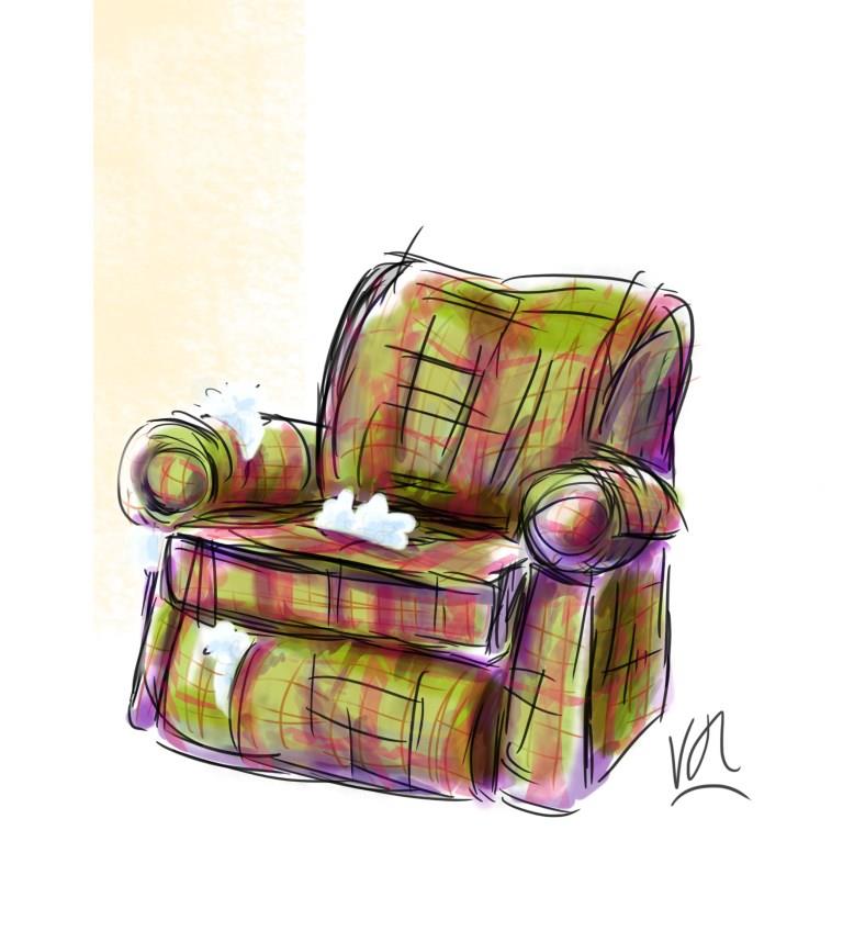
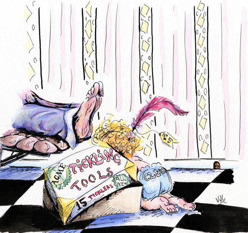
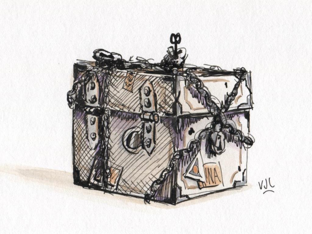
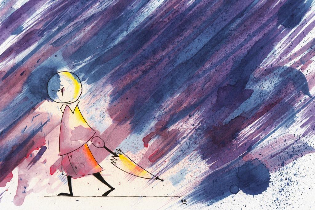
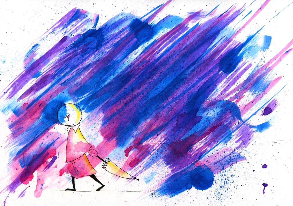
These are from Week 30 to Week 33 #illo52weeks. The theme for Week 30 was Home, and for a change I did this one 100% digitally. Yes, there is an influence from Martin Crane's beloved chair in the TV sit-com 'Frasier'. Week 31's theme was Tools. I decided against a garage wall scene, and although a Wile E. Coyote with ACME products was tempting, I finally went with this....since Father's Day is approaching. Week 32's theme was Secret. A well fortified box is where many of us would like to keep our secrets safe. The theme for Week 33 was Sadness. I decided to experiment with some wet wash effects for this one. Here is the first version, which is cropped. For this second version I adjusted the colour brightness to get the image closer to the original idea I wanted to achieve. I know I haven't posted anything yet about the First Flight course with Oatley Academy. I've done plenty of sketches and mood boards, and I'll get around to sharing some of them soon.
0 Comments
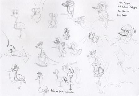
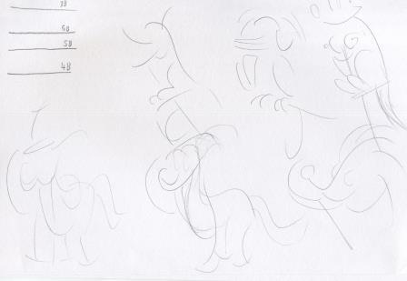
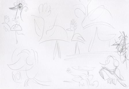
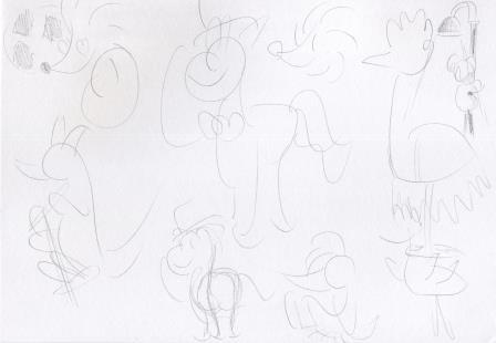
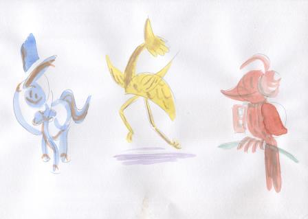
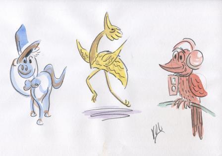
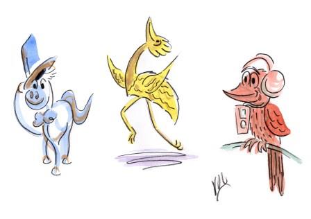
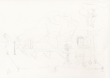
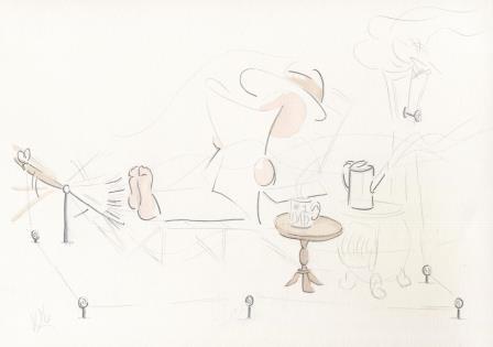
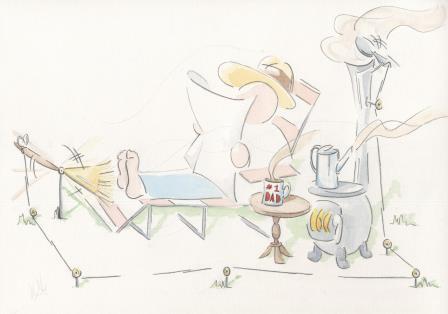
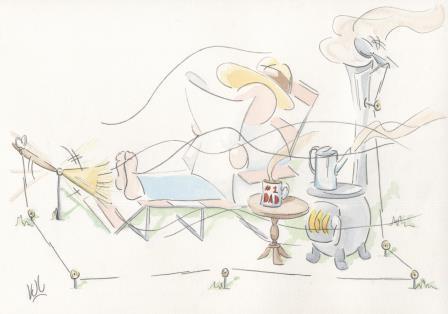
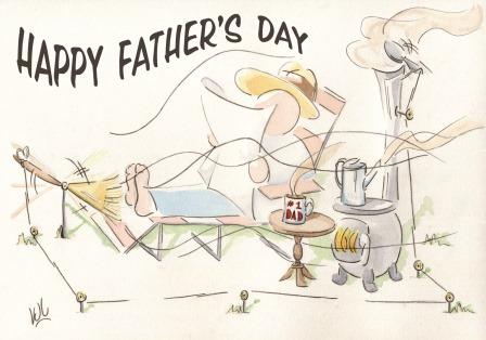
I am getting close to submitting the third set of artworks for assessment to the London Art College's correspondence course D6 Illustrating Children's Books. Of the set, the first part is a smaller project, outline drawings of animals doing silly things. The brief went something like this: Make 3 or 4 loose bold outline drawings of animals doing silly things. Use bold and simple shapes. Draw with thick, soft pencil or crayon, and use a different primary colour for each animal. Add a contrasting colour for interest. When dry add more line detail. Keep your audience of young children in mind. This exercise was well outside my comfort zone, because I love using close ink detail and loose work does not come naturally. Here are the initial ideas I had, in my usual style: I had to go much larger, and with thicker pencil. You can see here my pencil tests and the development of the horse, kangaroo and kookaburra ideas. The next sketches explore the dancing bird and the kookaburra further: And some more ideas, with the emu, kangaroo, horse, echidna and kookaburra. The next step was to give it a go on good cartridge paper. Here's a progress scan. We have the horse with the top hat, (blue with orange contrast); the dancing bird/emu, (yellow with purple contrast) and the kookaburra listening to music (red with green contrast). Now to add the extra pencil detail. I didn't want to go further and ruin them, so I decided not to redo them on heavier paper. But I did try to clean them up with Photoshop. I think I am happy with the final result. The more I look at them, the happier I get. So I decided to explore the thick pencil style a bit further and used it for my Father's Day picture. Firstly, here's the pencil sketch: And trying 'to keep it loose', here's the first wash. Another set of washes, and the image will get clearer: And adding in some more line work, and a bit more colour detail: With the final touches in Photoshop, it is now ready to go on this year's batch of Father's Day cards. So all in all, a very interesting exercise/project, despite all my initial misgivings.
|
News and Other StuffAbout recent artwork, inspirations and other things I find interesting. Archives
June 2024
Categories
All
|
All artwork and images on this website (unless stated otherwise) are the property of Vincent Cavanagh and cannot be used without his permission.
|
Social Links
|
Powered by Weebly
|
 RSS Feed