|
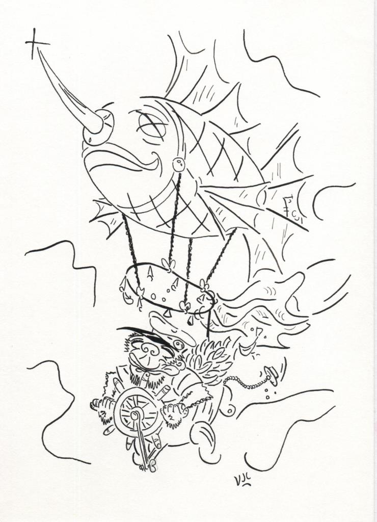
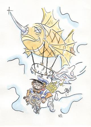
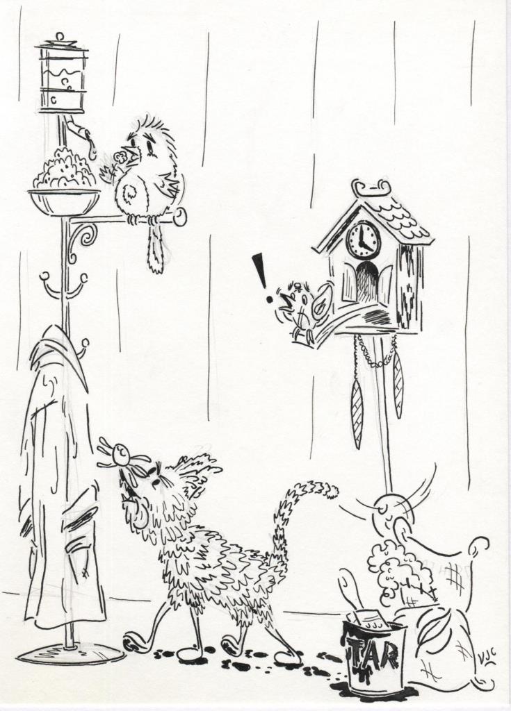
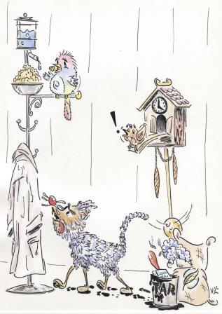
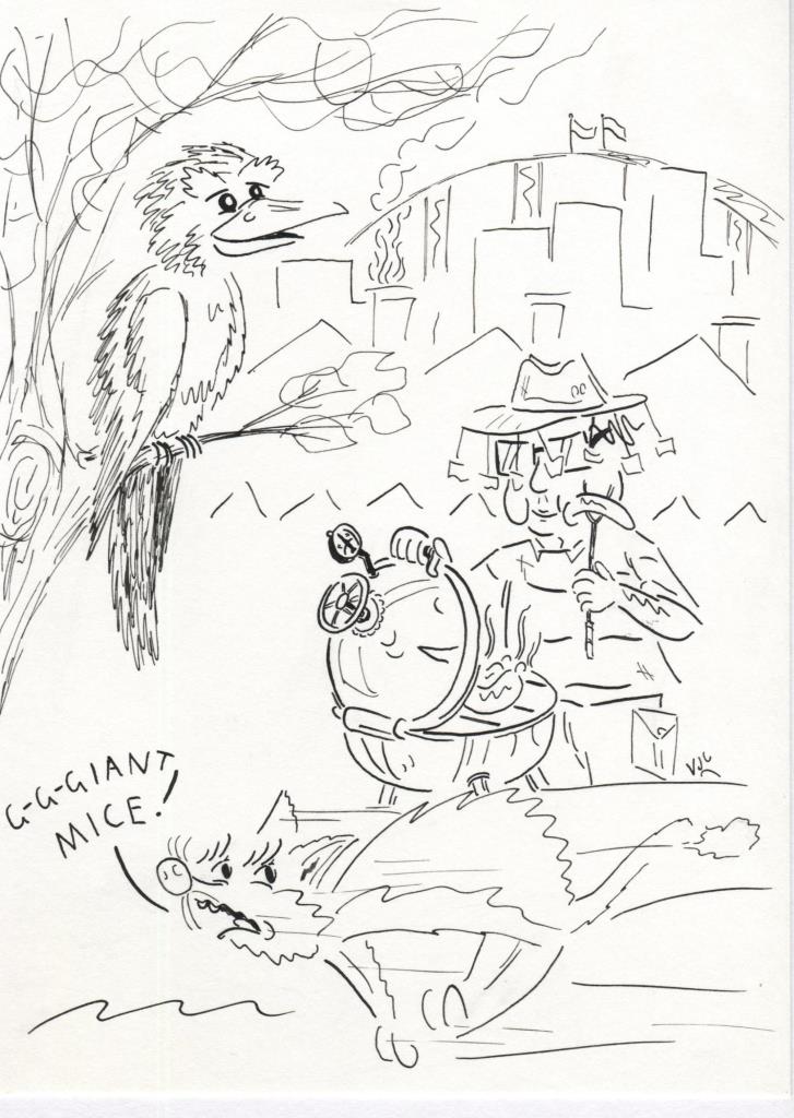
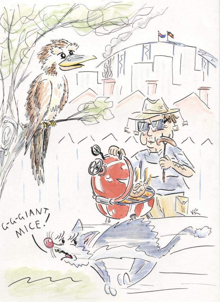
This challenge for illustrators has been going for a few years, but this is the first time I am giving it a go. At the beginning of the year a list is posted online containing a list of weekly themes. http://illo52weeks.blogspot.com.au/search/label/2017%20themes Illustrators can then post their efforts for each weekly theme on social media with the #illo52weeks hashtag. Mine are getting posted to Twitter @VJCavanagh . So far I'm using different paper for this challenge, both in manufacturer and in size (170mm x 235mm), and I've been using nib ink too. Week 1's theme was Whimsy. Here is the ink only version: And the coloured one Week 2's theme was Feathered Animals. And here's the difference colour makes... Week 3's theme was Australiana (in time for Australia Day on 26 January) And let's add some colour... So far the challenge has been fun. It is a pleasant change to have such an open ended brief to work with. Should I remember, I'll go for medium compression rather than full compression from here on in with this size paper because the full compression isn't giving a good online image.
Week 4 is an Ode to a favourite children's book....however I haven't yet decided what my favourite children's book is yet.
0 Comments
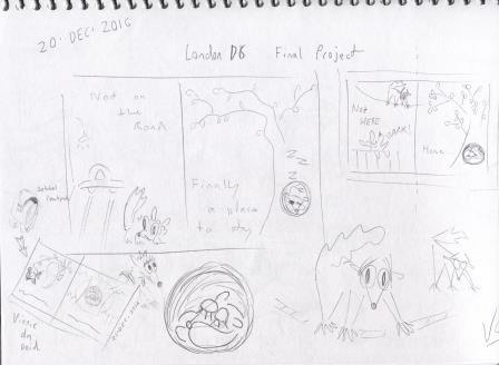
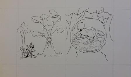
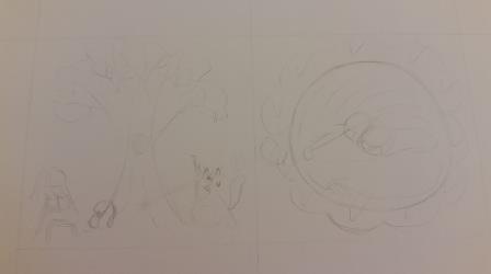
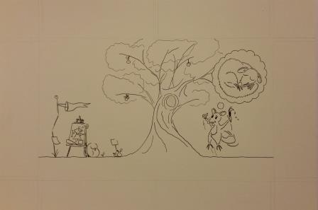
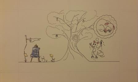
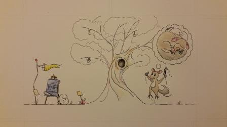
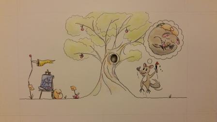
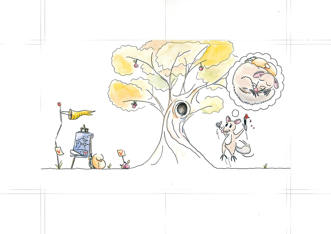
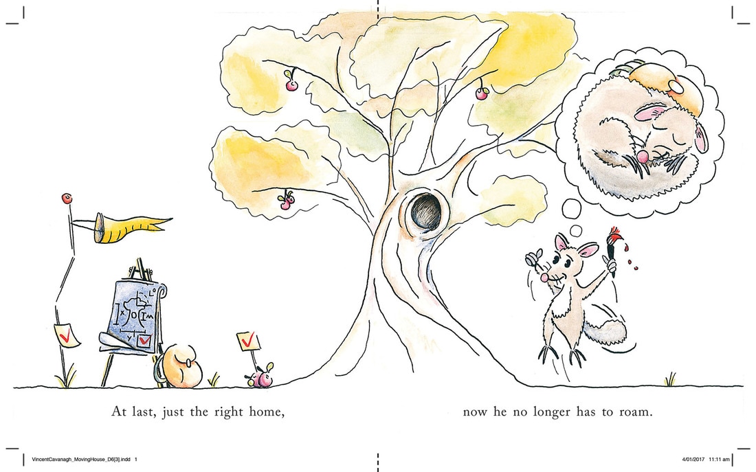
Here it is.....the final sixth set of artworks for assessment to the London Art College's correspondence course D6 Illustrating Children's Books. Hooray! Of the set, the second part is a bigger project, which this time had to be done as a double page spread on an A3 page with both a bleed 5mm and a slug area 50mm, which ends up with a single page measuring 180mm tall and 150mm wide. The brief went something like this: Illustrate a double page spread from a story book aimed at 3 to 5 year olds called 'Moving House'. This will be the last page where your chosen character (human or animal) at last finds just the right home. The story is about this character's difficulties in finding a good place to move into. The text, 'At last, just the right home, now he no longer has to roam' will run along the bottom of the page. Unsurprisingly, due to a furry creature who recently decided that our home was just the right place, and our efforts to dissuade said creature, the character was a possum. Here are my initial ideas, which had to be scrapped once I re-read the brief and couldn't use a diagonal for the text. I got as far as inking the next idea, before eventually agreeing that it wasn't really working. (The next few images are from photographs.) Yet another idea got scapped. Sorry, this one only got as far as pencil stage, so it is more difficult to see. There are blueprints and a backpack on the left of the tree, and on the other side of that tree is the possum with a pencil behind his ear sizing up the dimensions of the tree and giving it a mental tick. Then we have a contented sleeping possum in that tree hollow. Why did it get scapped? It was working better, but still hadn't nailed it - and it was pointed out that when a double page spead is requested, a diptych is unlikely to satisfy the brief especially when it is for the final double page spread. Back to the drawing board.... Was all this anguish worth it? I think so. Now we have the possum showing the joy and excitement that was missing from previous drafts, and the new home has passed several more tests. Now to start adding the colour, and begin bringing it to life... Finishing the watercolour on the possums came next. And then the tree, the fruit, the backpack and the all important red ticks. When the watercolour work was finished, an A3 scan was required and that wasn't easy during the Christmas/NewYear period where commercial scanners were offline. For such delicate colours, a commercial quality scan was essential. Then some Photoshop clean up was required, a little colour management, and hightlighting the bleed and crop marks, because when you have to further adjust to 1500 pixels wide to submit the project they tend to become close to invisible. Now to add in the given text, and remove the slug, to show what the final art would look like. With this artwork, the course work for the Diploma in Illustrating Children's Books with the London Art College is complete. The coursework was mailed from London on 12 Jan 2016 and arrived a week or so later, so I am very pleased to have completed it within the 12 month window.
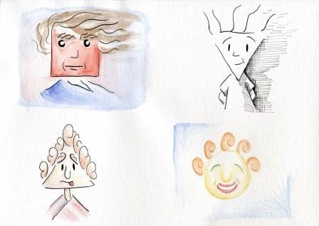
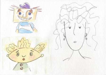
What now? That's a very good question. I'm sending out resumes, and illustration portfolios, hoping for paid employment or an illustration agent - or both. I will also be looking into further studies (perhaps something different like barrista training maybe) and want to give the 52 Week Illustration Challenge a go this year. The best way to find out what happens next is to sign up for my email newsletter, it has been going for 4 years and the 33rd issue is due mid January 2017. The end is in sight. This is the sixth and final set of artworks for assessment to the London Art College's correspondence course D6 Illustrating Children's Books. Of the set, the first part is a smaller project, which was an exercise in faces and shapes. The brief went something like this: Draw a series of rough geometic shapes: a circle, an oval, an up pointing triangle, a down pointing triangle, a square, a rectangle and a long U shape. Create faces from these shapes. Use exaggerated expressions. Experiment with colour, materials and types of line. To get the experimentation right, I wrote out a list of methods. Nib ink with minimum detail Pen ink with more detail Nib ink with watercolour Pen ink with watercolour Ink with coloured pencil Watercolour first, ink last Watercolour and pencil, with no ink Then the fun started pairing up shape with method. Here's the first page And the second page Yes, this exercise was fun indeed. One more exercise to go....
|
News and Other StuffAbout recent artwork, inspirations and other things I find interesting. Archives
June 2024
Categories
All
|
All artwork and images on this website (unless stated otherwise) are the property of Vincent Cavanagh and cannot be used without his permission.
|
Social Links
|
Powered by Weebly
|

 RSS Feed