|
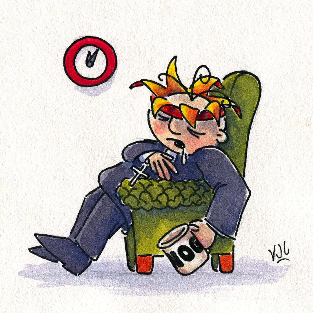
Surrealism incoming! Illustrated 30 March 2024 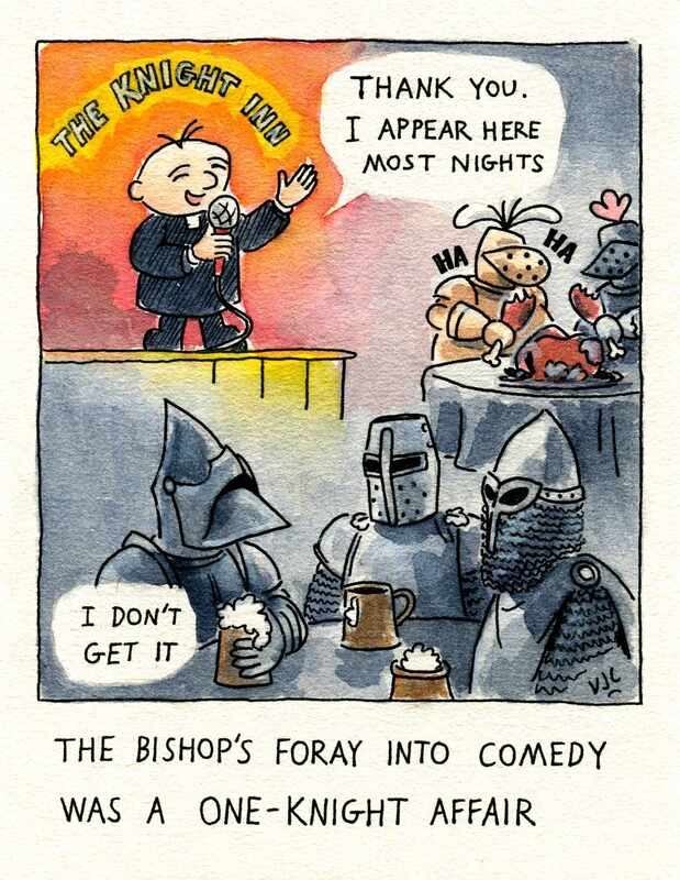 Vincent Cavanagh, 2024 A spotlight on Bishop Stumbers’ short-lived career in stand-up comedy. Congratulations to anyone who “gets” the cameo appearances on the far side table ;) With apologies to Messrs Astley and Baker. Vincent Cavanagh 30 Mar 2024 / Holy Saturday
0 Comments
Happy Feast of St Joseph. Painted 14 March 2024 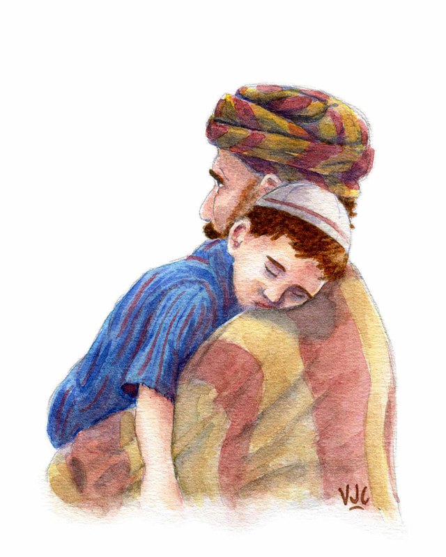 ‘St Joseph and Jesus (2024)’, Vincent Cavanagh, 2024 This painting may have only taken a day to paint, but it was a whole year—and two months—in the making. The product of a deadline that I didn’t think that I was even supposed to be working towards and God’s Timing. Aack! Leaving the histrionics aside, the photograph that this picture of St Joseph and the child Jesus is based upon was taken at a local church just before mass. A father was sitting with his family in a pew, about three rows over, holding his sleeping youngest son over his shoulder. One of those “take a photo or regret it”–moments from God. In the end, very little actually changed from the photograph—well, apart from changing clothes to robes, adding head coverings, and including hair on the back of St Joseph’s head, of course.
This whole hectic schedule of events was due to a conflicting parish event after the youth night and the lateness of the St Joseph’s Day Eve party at Joseph House being on at a prohibitively late time for me to attend. In the end the picture was printed (Thank God!) and present to the housemates, and it should now be hanging somewhere inside Joseph House. Vincent Cavanagh 19 Mar 2024 Now, as for an update on my previous update about working on writing down my experiences of WYD Lisbon, that’s no longer moving forward. I’m not joking when I write that it was a commandment from on high. And given how much I was reliving certain emotions to an unhealthy amount, I’m more than alright with just letting it drop and focusing on what God actually wants me to be focused on instead. Ask God before you leap into things whether you should be leaping into them at all. P.S. Also, the writing was the reason that I only had a single day left to paint Joseph and Jesus. (Face palm) Oi vey! Illustrated 1 January 2023
Pencilled 17 Jul 2023. Painted 18 Jul 2023.
Sketched 29 Jun 2023. Painted 6 Jul 2023.
Painted 2–4 March 2023. 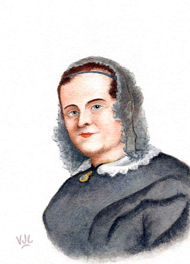 Vincent Cavanagh © 2023 Rather than fail admirably at trying to condense the epic life of Mrs Chisholm into a few measly paragraphs, I will direct you instead to the Friends of Caroline Chisholm website for a greater insight to her and her works than I could ever attempt to do justice within the confines of this blog.
Link to the Mrs Chisholm website. Painted 23–24, 26 Feb 2023. 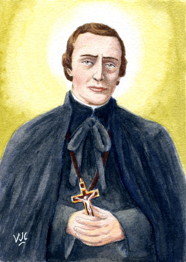 Vincent Cavanagh © 2023 St Peter Chanel is the Protomartyr of Oceania, and Patron of Wallis and Futuna.
He was a French Marist father and religious superior of seven fellow Marist missionaries sent out to the region, having left France on the 24th of December 1836. Painted 21–22 Feb 2023. 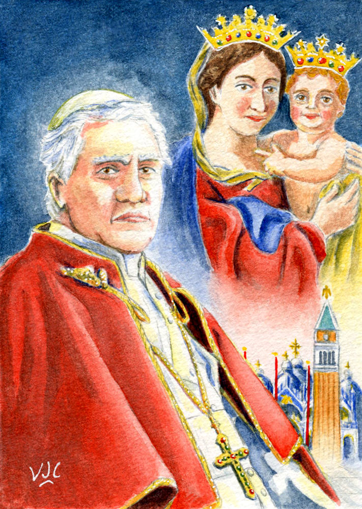 Vincent Cavanagh © 2023 St Pius X was the 259th Pope and successor to St Peter. He was a vehement opponent of what he called "Modernism" inside the theological circles of the Roman Catholic Church.
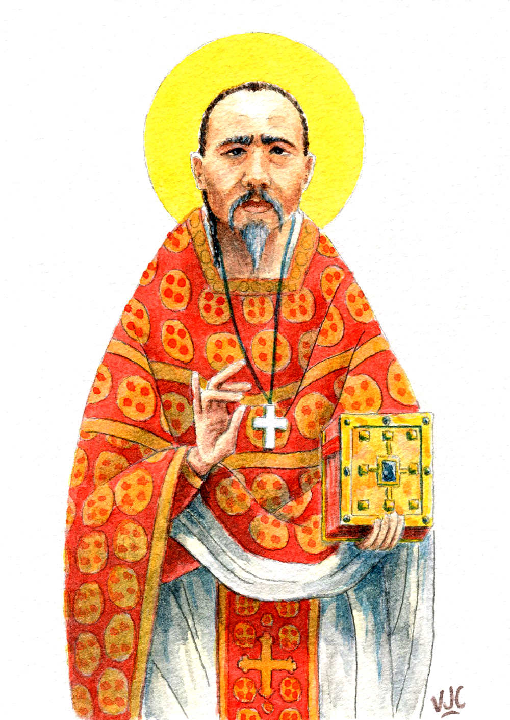
Something that the church is still fighting with today, what may be bluntly explained as: trying to convert the church to appease the (fickle) world, rather than converting the world to appease (and please) God the Father. 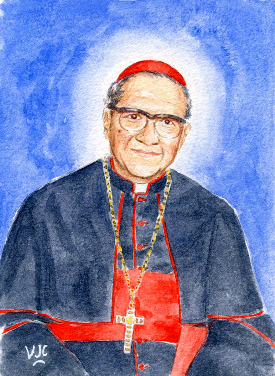 Vincent Cavanagh © 2023 Venerable François-Xavier Nguyễn Văn Thuận
Former Coadjutor Archbishop of Sài Gòn (now Hồ Chí Minh City), imprisoned for his faith and family connections by the communist government of Vietnam for 13 years after the fall of Sài Gòn. He was released in 1988 but kept under house arrest. He became exiled in 1991 when he was allowed to visit Rome but never to return to Vietnam. He died in Rome in 2002, aged 74. On the fifth anniversary of his death his cause for sainthood was begun. He was named Venerable by Pope Francis on 4 May 2017, the first step on the long road to being made a Saint by the Catholic Church. This painting was the fruit of listening to the introduction and homily by the Archbishop of Sydney, Anthony Fisher, for the Solemn Pontifical Funeral Mass of George Cardinal Pell (1941–2023) on 2 Feb 2023. Vincent Cavanagh ~ 3 February 2023 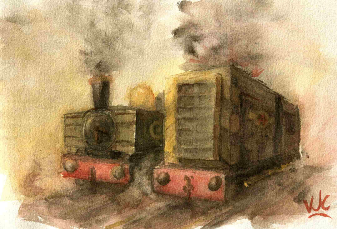 'Pannier Tank and Diesel Shunter' Vincent Cavanagh © 2022 I have painted in a while, but I did thankfully do a small "just for fun" painting on Good Friday (15 April 2022).
It's little scene, set in either the early hours of the morning or before dusk, containing a generic-looking Great Western Railway Pannier Tank engine opposite a British Railways Class 08 Diesel shunter that appears to be having bit of trouble starting up. Note the fireworks coming out the top of it. |

News and Other StuffAbout recent artwork, inspirations and other things I find interesting. Archives
April 2024
Categories
All
|
 RSS Feed
All artwork and images on this website (unless stated otherwise) are the property of Vincent Cavanagh and cannot be used without his permission.
|
Social Links
|
Proudly powered by Weebly
|