|
Continuing the fifth set of artworks for assessment to the London Art College's correspondence course D6 Illustrating Children's Books: Of the set, the second part is a much bigger project, which was also exercise in black and white work, to be inspired by the text of a creepy poem. The brief went something like this: The image should be suitable for 5-7 year olds. Make it portrait orientation. The given poem should be in the centre, with the illustration forming a border around it. Give it a white border, no bleed, and use 18cm wide and 25cm tall, with the poem to sit in an area of 8cm wide and 14cm tall. Balancing the black and white is important, as is creating a creepy feeling. Use the images evoked by the text, but don't be limited to them. The first part was getting the layout right, and that meant using InDesign and doing some research on how to display a poem where the first line is also the title. Accordingly the first line was in bold with a stanza-sized gap to the second line. Then I needed to try out some ideas for the illustrated border. So I printed out a few templates and started sketching. With the first one I tried for a Phantom of the Opera style character, but ditched that idea. 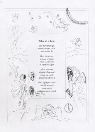 The outer parallel line shows the trimmed paper size and the inner parallel line shows the white border. The next sketch developed the grim reaper and the moon further. 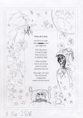 Too many bats didn't create enough interest, so I looked into ghostly options and refined the witch a bit. 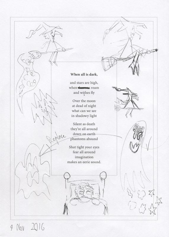 Now to get out the good paper and begin: This is how it looked around halfway through. Again I needed to use nib ink to get the black as consistent as possible. 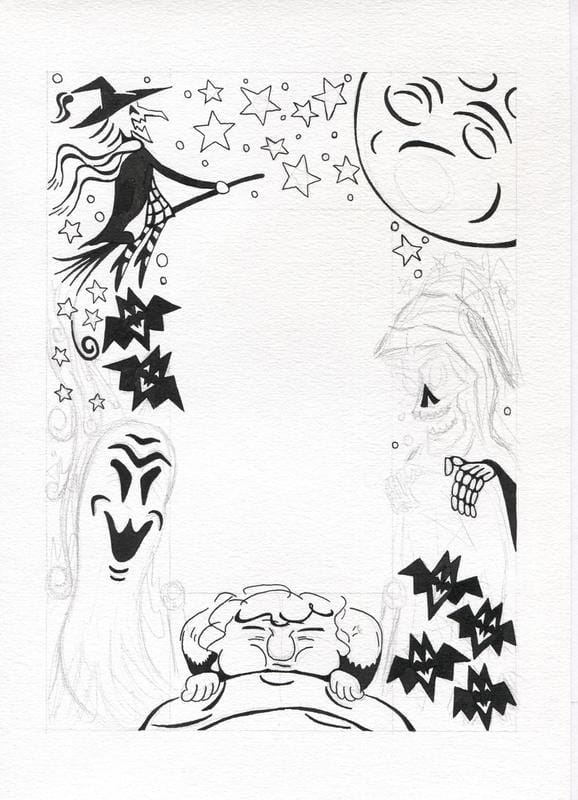 And here's what the illustration border looked like before it got cleaned up in Photoshop: Getting the balance of white and black required more work on the stars at the top of the page. 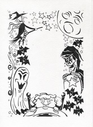 And what it looked like after the Photoshop work: I've added a hairline border using the blog tools, so that you can see that there is a few mm of white border between the illustration and edge of the trimmed page. It is easiest to see under the boy and beside the grim reaper. 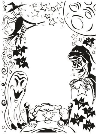 And now to add in the pre-prepared text, without the spelling mistakes. 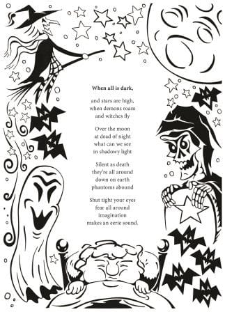 The thin white border is still there, it is just hard to see on a white background.
Creepy work like this rarely features in my visual diary! With Unit 5 done, it is time to start working on the 6th and final set of projects for this course.
0 Comments
Now for the fifth set of artworks for assessment to the London Art College's correspondence course D6 Illustrating Children's Books. Of the set, the first part is a smaller project, which was an exercise in black and white work, with a creepy Halloween vibe. The brief went something like this: Take a vertical sheet of A4 paper and leave the middle third of it blank. On the left hand side use more white on black and on the right hand side use more black on white. Shapes on each side should complement but not repeat each other, because this is to be an illustration foremost and not a pattern. Everything starts with a sketch. So here is the initial idea in pencil. 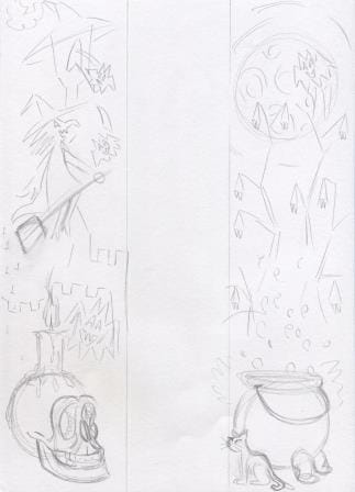 That idea got refined a bit, and tested to see how it would go 'black and white' wise with black watercolour. 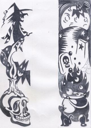 Trying to work white on black, and then black on white, is guaranteed to make your head spin. I wasn't happy with how some of the elements were working together, so I did another test page to see if I could make the witch's scarf and broom better on one side and the cauldron on the other side. From these tests, it was clear that in order to get consistent black and white contrast, I was going to need to use nib ink. 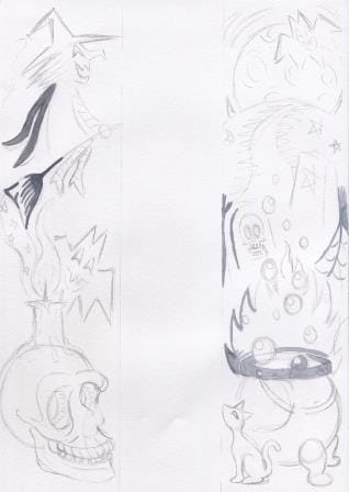 It was now time to start the final art. Here is the initial pencil stage. 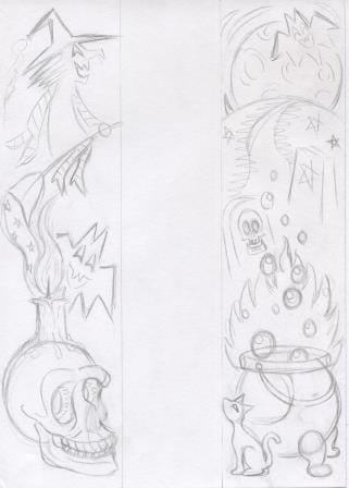 And how it looked after the nib ink was done. It was going to have to go into Photoshop to clean out the pencil marks, and to adjust the area where the candle flame and the broom exhaust meet, and to add whiskers to the cat. 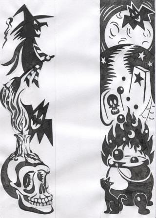 The whole Photoshop cleaning process took longer than doing the slow nib ink work, but it was well worth doing to get this result. 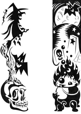 This was a challenging exercise to do. I enjoyed the challenge, but I'd have to have either a really clear idea or simpler shapes to consider doing something similar in the future.
Usually in late April my Mum reminds me that we need a new artwork to go on our Mother's Day cards for our female relatives. Here is what I came up with for 2016. 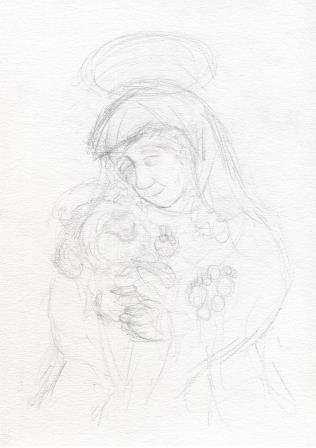 Firstly a rough pencil sketch. 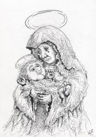 Then comes the ink. For this picture I used nib ink rather than my usual felt tip ink. This scan was before I rubbed out the underlying pencil marks. 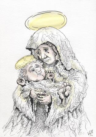 Now to add a bit of colour. Firstly initial washes of gold and a little skin tone. 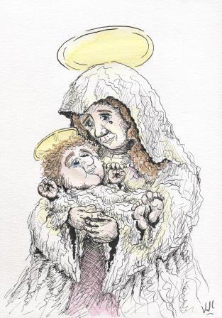 Then hair and shadow areas. At this point I was in two minds whether to add the expected blue or not. The need for a bit more contrast between mother and child tipped the balance. 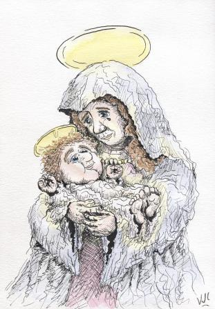 Light pinks don't tend to scan very well, sadly. But I am happy with the final result, and so was Mum, my Aunts and Grandmothers. I'm hoping our heavenly Mother was happy with it too.
|
News and Other StuffAbout recent artwork, inspirations and other things I find interesting. Archives
April 2024
Categories
All
|
 RSS Feed
All artwork and images on this website (unless stated otherwise) are the property of Vincent Cavanagh and cannot be used without his permission.
|
Social Links
|
Proudly powered by Weebly
|