|
Inktober for 2019 is almost over, apart from the drawing I am working on now, there are only 2 more black & white Socket Head drawings to go. It has been a worthwhile personal discipline, but whether it has had any additional value remains to be seen. I doubt I will attempt it again. Here are a selection of 5 drawings from the series: From Day 15, theme 'Legend' 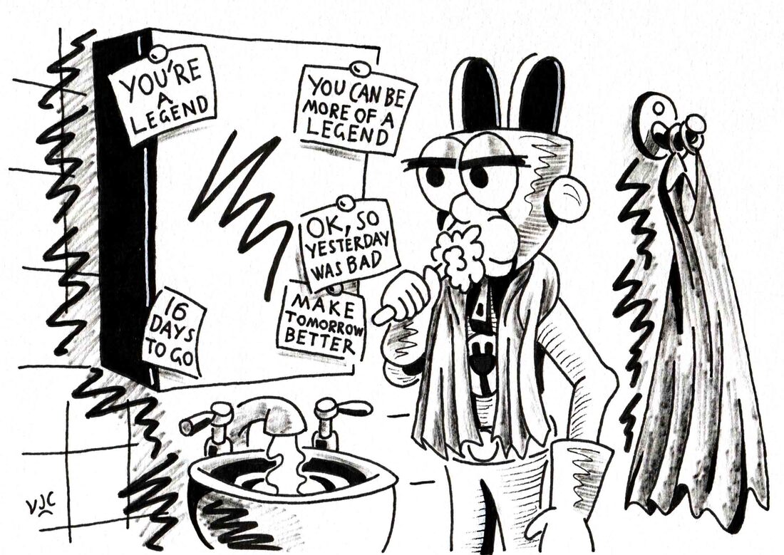 From Day 16, theme Wild 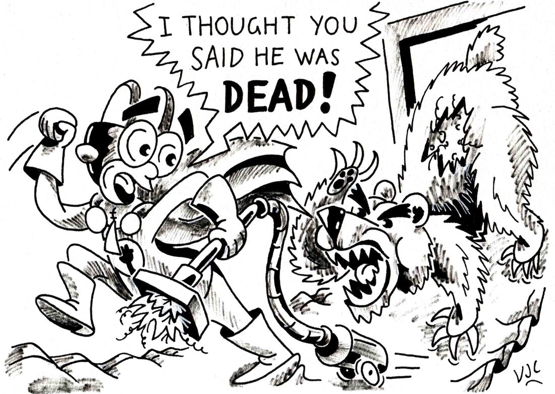 From Day 17, theme Ornament 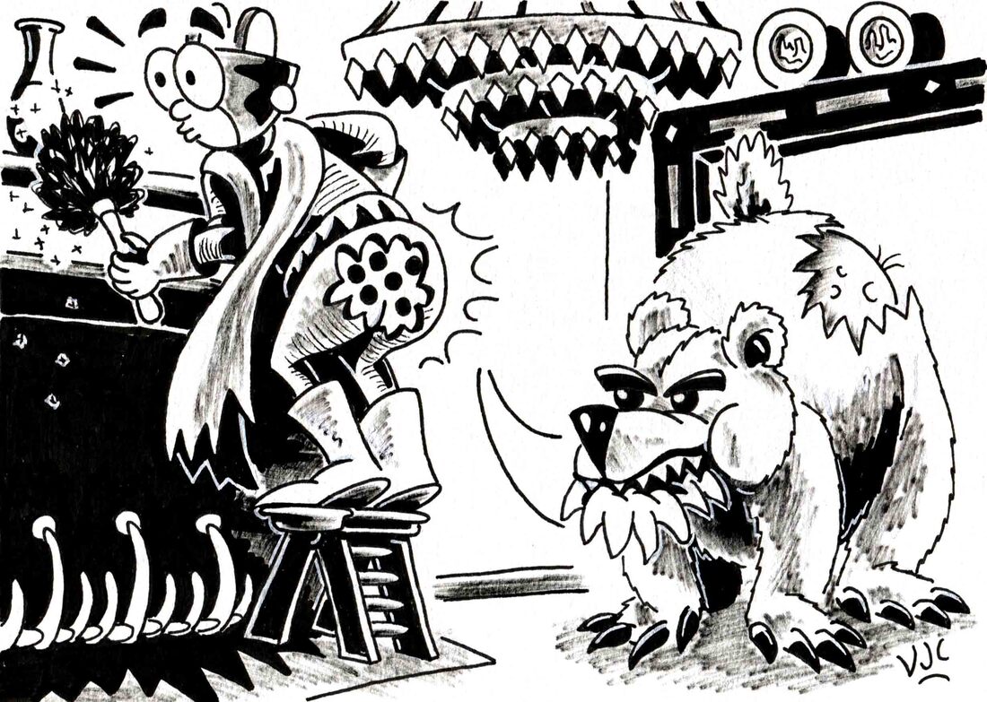 From Day 22, theme Ghost 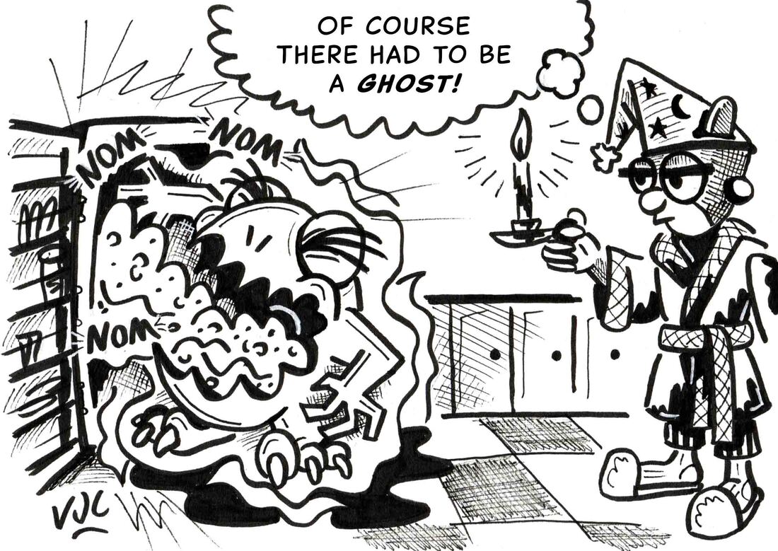 From Day 24, theme Dizzy 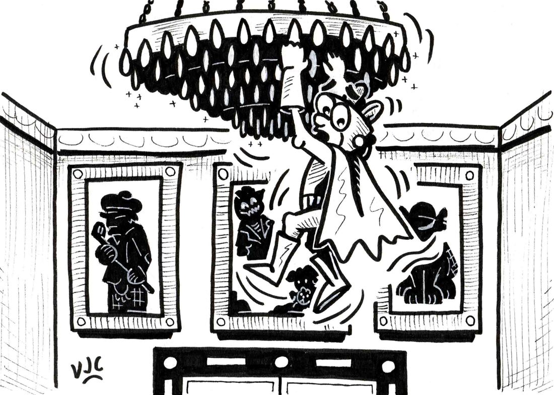 The rest of them you can see on my Instagram (@cavanaghcreative), Twitter (@VJCavanagh) and Facebook accounts.
0 Comments
Sometimes you just can't keep a good character down. Socket Head has been out and about...... First stop is playing board games with Sailor Jim: 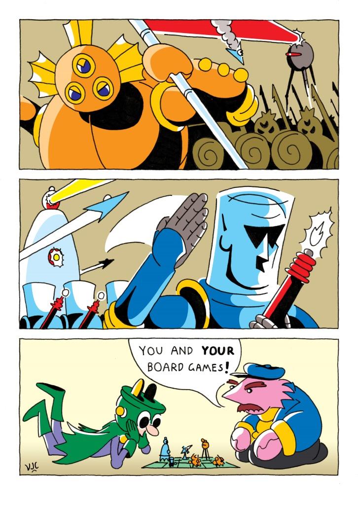 Then someone, possibly you, left him at home, alone and unsupervised.... 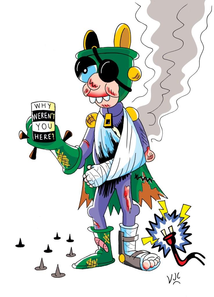 Then there was that time when Socket Head wanted to return a gift of inferior workmanship: 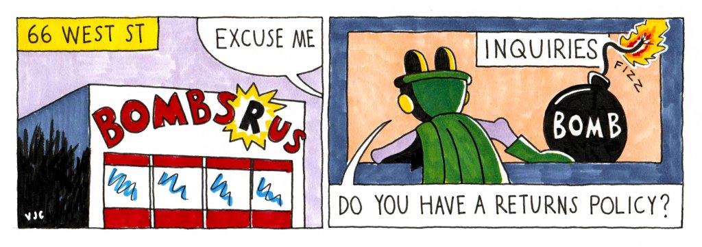 And that time when he went shopping: 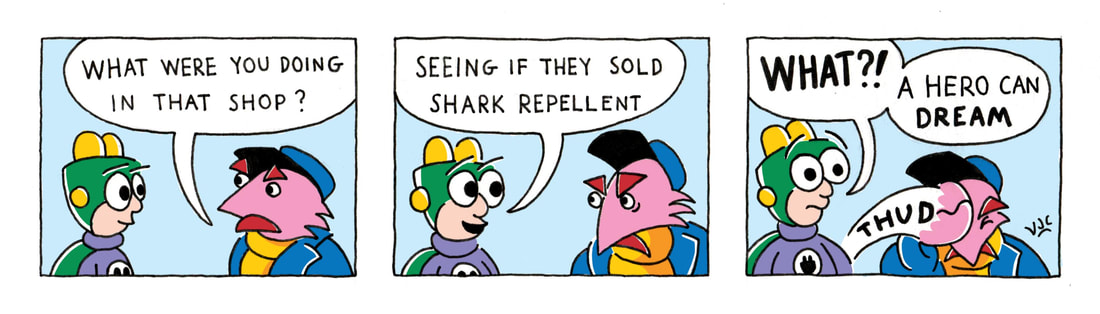 He has also been to see the chiropractor and the podiatrist,
but those adventures can be shared next time. The month of June 2018 was a tough one because it contained the last three weeks of life of my paternal grandmother, and her funeral. During that month, life was anything but normal. You can read about her life here, which contains footage from an interview I did with her a few weeks before her health really declined, which I edited later. 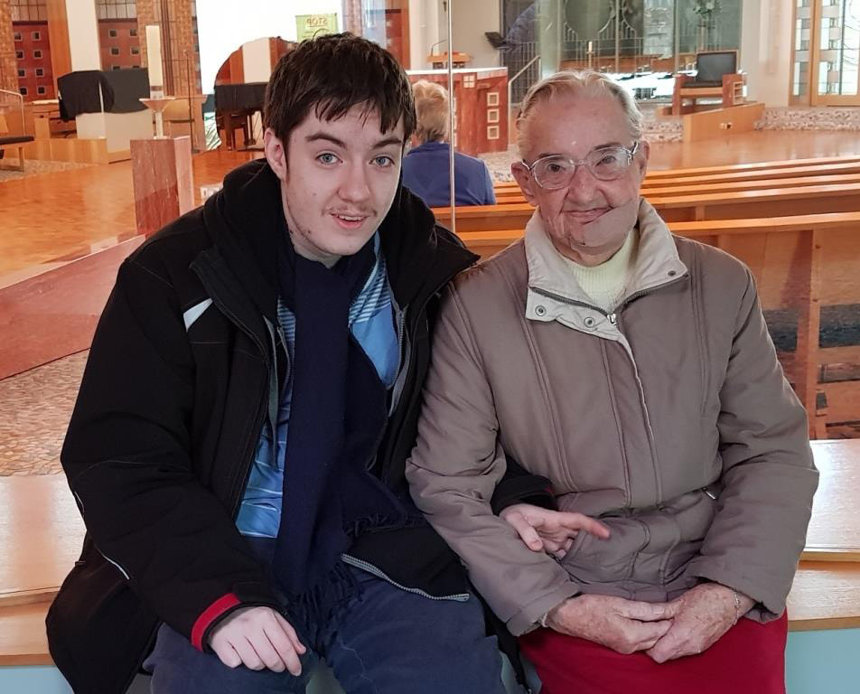 Things went very quiet on the creative front, but I was able to catch up to the 52 weekly illustration timetable earlier this week. The theme for Week 21 was Haunted House, for which I deliberately wanted a limited colour palette. Yes, it does have a bit of an 'Adams Family' vibe. 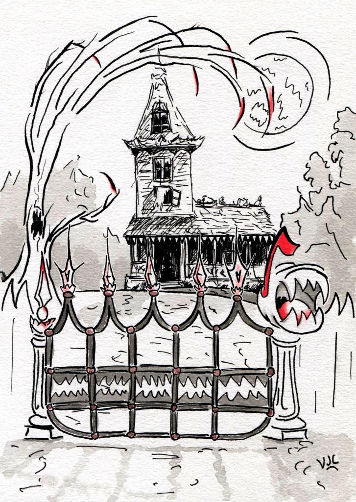 For Week 22 the theme was Spectacles, which this teddy bear is wearing in a haphazard way. 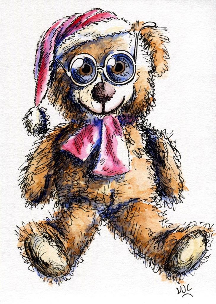 Cottage was the theme for Week 23, and if you look carefully you will find that a small creature has made a cottage-home on top of the much larger swamp creature. 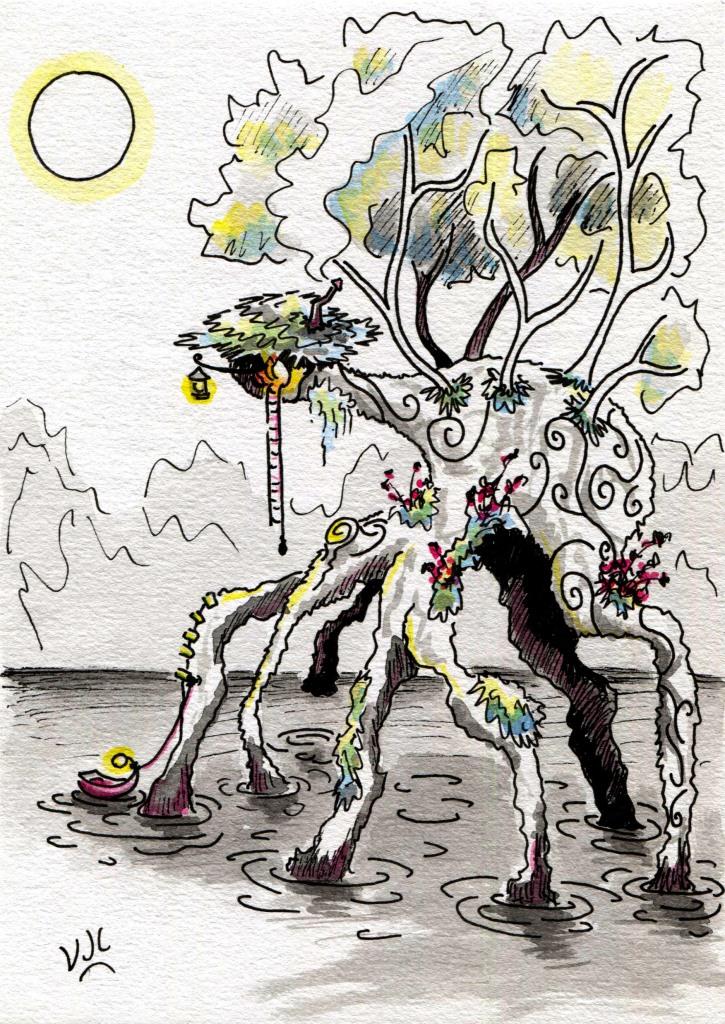 With the Week 24 theme of Anatomy I decided to have some fun. This well dressed frog was off to a very exclusive soiree when his plans were interrupted by some students of animal anatomy, and he very much wants them to get it over with so that he can resume his evening plans. 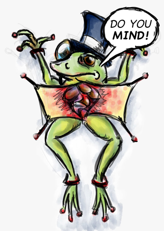 Because Week 25's theme was Nursery Rhyme, trying to choose one out of the many was proving to be difficult, so I combined three of them. Thus we have the mouse up the clock from Hickory Dickory Dock: Little Bo Peep with some of her sheep stopping to have a look at this sight; and Humpty Dumpty also surprised by this unusual view. 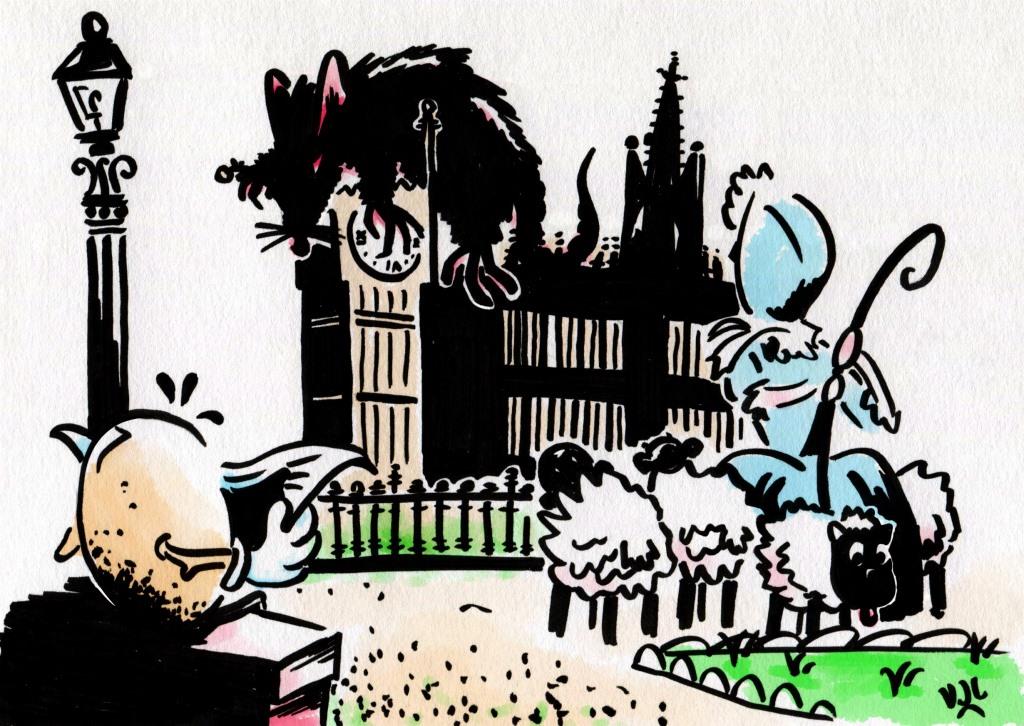 If you don't want to wait for the next blog-post to see Weeks 26 and 27, Facebook and Twitter are where you should look.
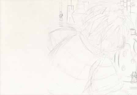
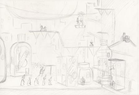
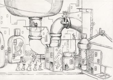
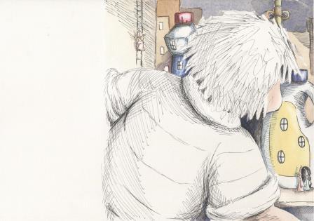
I am just about ready to submit the second set of artworks for assessment to the London Art College's correspondence course D6 Illustrating Children's Books. Of the set, the second part is a major project, a double page spread. The brief went something like this: Allow for a text area taking up about 1/3 of the left hand page. Sebastian is seen to either build or find an imaginary world under the kitchen sink. Make it detailed with a cartoony edge, and use good contrasts of scale. Allow a 30mm border between the trimmed edge of the page and the start of the text. The text was not supplied. Here's the layout idea from my sketchbook: 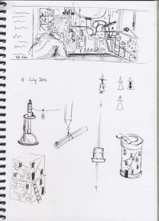 And my pencil roughs:
The next part was to add the ink.
And then add a bit more ink, increasing the lights and darks and adding more detail.
Next I took some photocopies, and used coloured pencils to test my colour arrangement ideas.
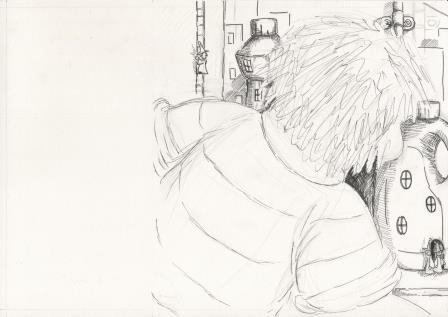
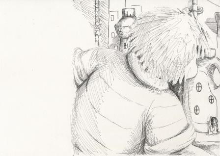
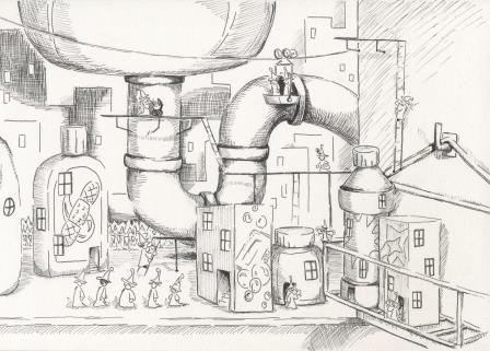
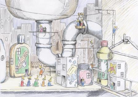
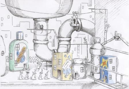
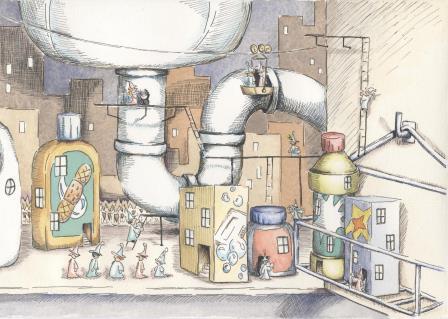
It seemed like having minimum colour on Sebastian made for a better flow from text area to city, and made the city the feature of the double page spread. Now to begin the watercolour work. Masking fluid first. For this part it was easier to take photos rather than scans. I started with the browns and beiges. 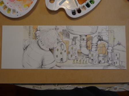 Then came some blues and greens. 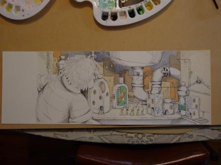 Followed by yellows and reds. 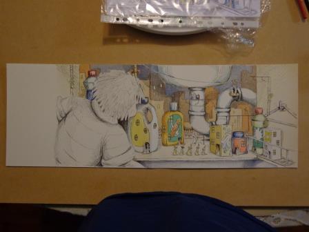 Then some skin tones on Sebastian, and fine tonal detail. The little people still need colour. 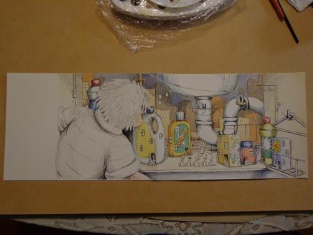 Here's the final raw artwork, with the bleed area still present.
Now to stitch it together with Photoshop and remove a few minor blemishes. 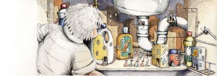 And what it would look like with the 5mm bleed removed, in a picture book. 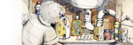 And lastly, how a bit of text would look. 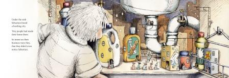 I'm very pleased that this project is finished. I enjoyed it, but it took a lot of work to complete.
I am just about ready to submit the second set of artworks for assessment to the London Art College's correspondence course D6 Illustrating Children's Books. The first part of each set is smaller and easier, and the second one is a major project. This time the smaller part of the project was about contrast in scale, ink work, texture and lighting. For this one the brief was very detailed. I needed to think about some kind of household cleaning product's bottle and imagine it as a building. Next to the building a small creature was needed (person or animal or alien)/ that would intrigue and engage a child but not frighten them. Lighting had to come in from one side, black ink was the medium to be used, and texture had to be used to both differentiate and unite both objects on the A4 page. Firstly we had to work-up some roughs, and so experiment with the ideas we had. Here's my sketchbook page: 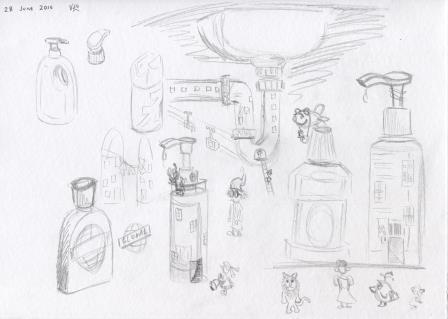 The bottle to the far right and the bird-like creature under it became the raw ideas for the final artwork. Here it is in its needing to be cleaned state: 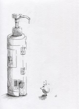 And what the final work looked like after it was cleaned up a bit, with the underlying pencil marks removed: 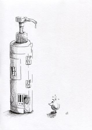 I love doing this kind of ink work, and it proved to be very good preparation for the second (major) part of the project.
|
News and Other StuffAbout recent artwork, inspirations and other things I find interesting. Archives
April 2024
Categories
All
|
 RSS Feed
All artwork and images on this website (unless stated otherwise) are the property of Vincent Cavanagh and cannot be used without his permission.
|
Social Links
|
Proudly powered by Weebly
|