|
For 2 reasons: 1) I've been preoccupied editing our June Holiday videos and; 2) I totally forgot about the website. Apologies. Okay so let's start with the artwork then; which requires us going back to May: 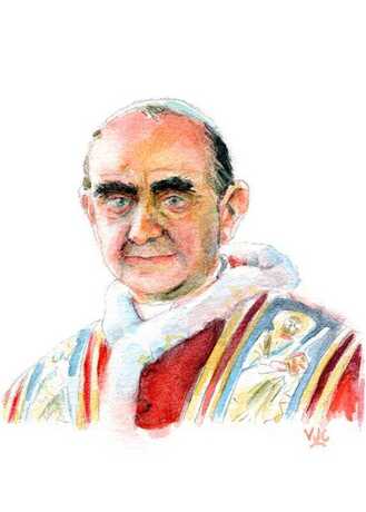 St Pope Paul VI.
0 Comments
Back in December 2020 Pope Francis proclaimed a Year of St Joseph (8 Dec 2020 – 8 Dec 2021) for the whole Catholic Church. More information about it can be found here, and about prayer to St Joseph here. Below are the first 3 images of St Joseph that I painted in the Year of St Joseph proper: 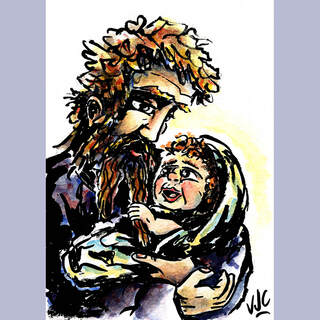 "St Joseph and the infant Jesus." The starting point for this image was the Gospel of Matthew, Chapter 1, Verse 20; which was one of the prompts from the #Adventus202One art challenge during Advent 2020. This image in not exactly of the moment described in Matthew's Gospel, but rather of a moment after Jesus' birth when St Joseph fell in love/accepted Jesus as his son for the 2nd or 3rd time. Also the main inspiration for this image was the idea: if St Joseph had a beard before Jesus was born, how much of it would have been left after Jesus' toddler year (ie. pulling part of Joseph's beard out)? 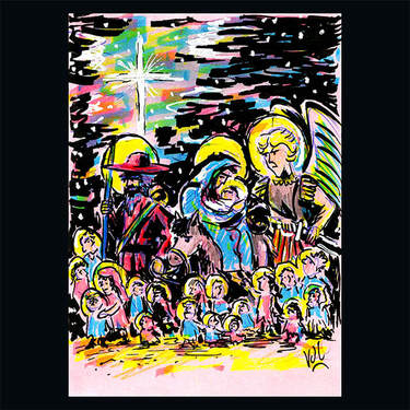 "The Holy Innocents/The Flight into Egypt." This image was also another inspiration from #Adventus202One, this time being close to the scripture reference: Matthew, Chapter 2, Verse 13–15. The inspiration for this was thinking about how the recently departed Holy Innocents may have processed with the Holy Family in their flight into Egypt from Herod's persecution, all under the protection St Michael the Archangel. I just sketched this one rather quickly on some coloured paper and inked it with a calligraphy marker and text highlighters, because I just wanted to get it done and I didn't care how I got it done. I'd been getting sick of doing so many watercolour pictures in a row and I wanted a break from that medium. 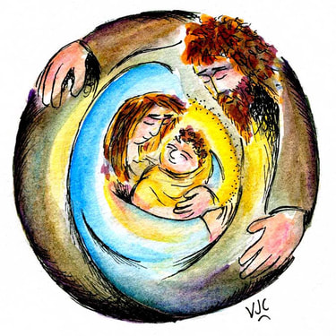 "St Joseph, Protector of the Holy Family." The title for this one basically explains all there is to this picture. Showing St Joseph as the Protector and Shield surround the Jesus and Mary.
Although I must not forget to acknowledge and appreciate @awememento's influence upon this particular painting of St Joseph and the Holy Family. And her Etsy page can be found here. Until next time, Happy Easter! The first assignment for my 3 month mentorship under Giuseppe Castellano was to research the illustrator Jean-Jacques Sempé. He is still alive, and known for loose ink work, real life settings, minimal colour, recognizable but not perfect depictions of people (for example children have light bulb shaped heads and adults have big noses). Then I needed to reference his style in a mock up of a cover for the New Yorker magazine, including the interaction of two characters and a background. This is one of my pages of practice sketches. 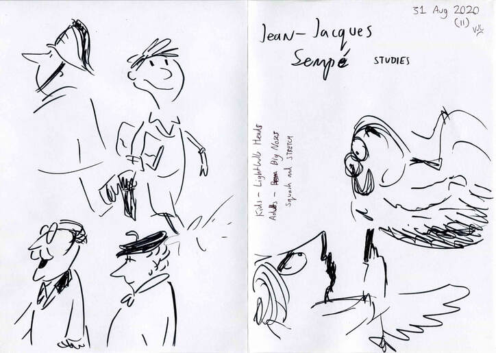 The next thing was to research covers for the New Yorker magazine. Most of them contained scenes from New York life, or what would be recognized as New York life, or else they were political. At times the spine and mast-head were colours other than black. So I researched New York, things like 20 things only New Yorkers would appreciate, or 10 jokes only New Yorkers will get. I needed to find either a humorous angle or something I am interested in. The stories of YouTube sensations Pizza Rat and Milkshake Squirrel were intriguing. I put together some thumb nail sketches: 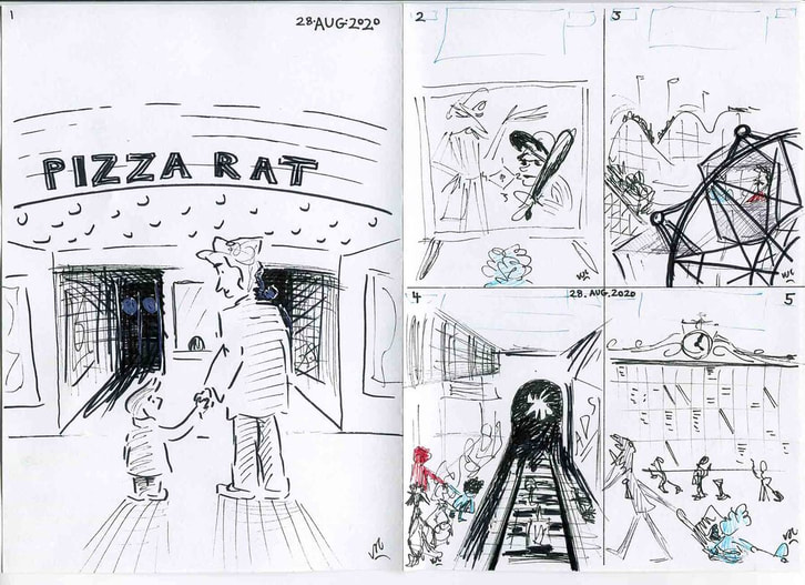 1. Pizza – Rat: Going to the Cinema with Dad. 2. Abbot and Costello on TV with child watching. 3. Father and child on a Ferris Wheel at an amusement park. 4. Child peering over subway platform to see train. 5. Child chasing after parent in front of giant destination board. Of these thumb nails, Pizza – Rat won. This is a scan of the ink work, below. 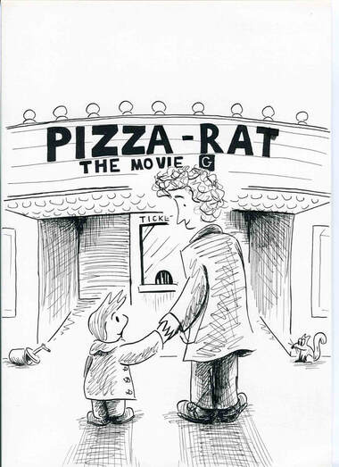 The next step was to get an idea of colour values digitally before putting any watercolour on. Then came watercolour. This is the raw image below: 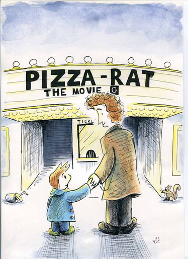 I then had to clean up the art work and remove/fix mistakes from inking, in Photoshop. And then add the copied masthead from a previous New Yorker cover, via Google and Photoshop again. 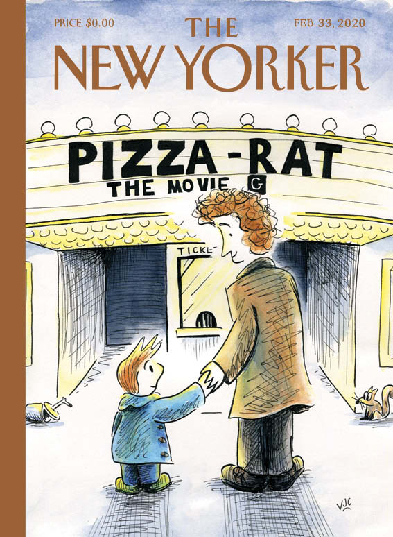 This final art is shown at a smaller size than actual size.
It had been quite a while since I used non-digital media, I had forgotten how nerve wracking it is when there is no room for mistakes. #IllusDept #mentorship #Sempé I am still on the down hill run for submitting the fourth set of artworks for assessment to the London Art College's correspondence course D6 Illustrating Children's Books. Of the set, the second part is a bigger project, which this time had to be bigger than A4 but no bigger than 40cm x 33cm, and landscape in orientation. The brief went something like this: Illustrate a single page spread from a gentle story about a cow who finally finds friendship with a bird. The story reveals what they learn and see of the world around them as they travel. Allow 1/4 of the page as a text area, and a bleed all round. The image has to be appealing, yet delicate, and in soft colours. Good contrasts of scale between bird and cow were recommended. The following was my first concept drawing, but it got discarded because it was too similar to what other students have done. 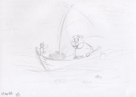 Then I did some roughs of the cow 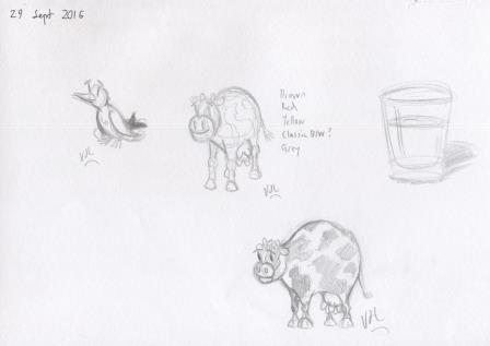 And played around with ideas for the bird 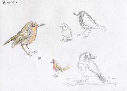 And then did a concept drawing I was happier with. I wanted to show the cow and bird relating to each other co-operatively. 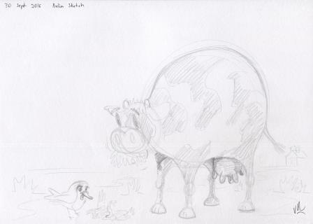 It was suggested to me that there would be more sense of travel if they were both facing the same direction. So I took that on board. From here on in, it is photographs because the A3 scanner does not do delicate colours well at all. 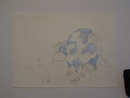 I went for a blue and white cow because I thought that black or dark would deaden the outcome, and blue and white are symbolic of milk if the average milk carton is anything to go by. 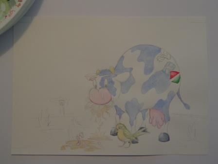 The plan was to do light initial washes with watercolour, and then add texture and softness with coloured pencil. 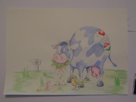 This is where the watercolour washes end, and the coloured pencil work starts 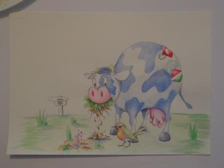 All the changes get very subtle here 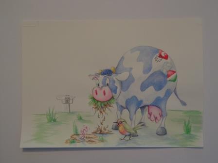 Now for a good quality scan from our local office supplies store 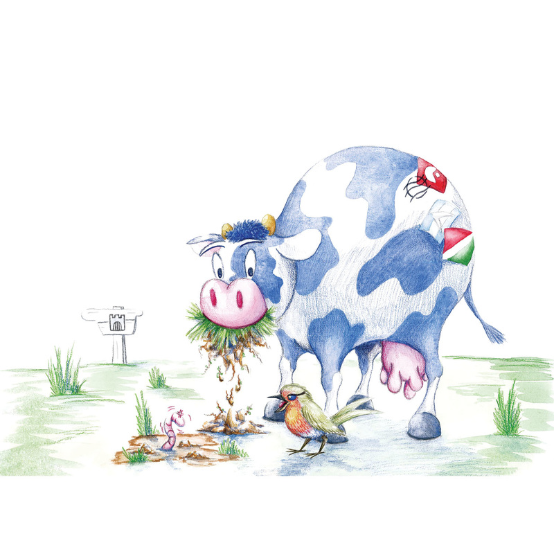 And then firstly to Photoshop for some clean-up of pencil marks and other things, and then to InDesign to add some original text. Here's how it ended up after all of that. Firstly with crop marks etc 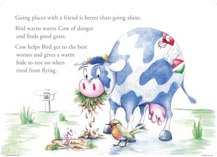 And then without crop marks 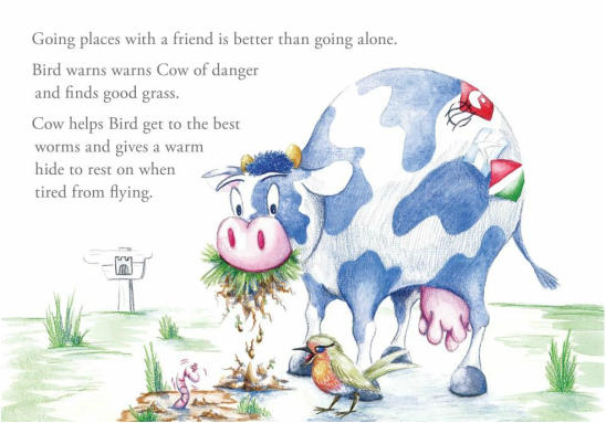 It is nice to have this one completed.
I am on the down hill run now for submitting the fourth set of artworks for assessment to the London Art College's correspondence course D6 Illustrating Children's Books. Of the set, the first part is a smaller project, which was an exercise in getting comfortable with drawing an animal in many different poses. The brief went something like this: Take a real animal and do several drawings of that animal walking around. Then start experimenting with ways of moving that this animal normally can't do, eg dancing. Put one of these animals on an A4 page, keeping it lively and well placed and add a bird. The animals should complement each other somehow. Keep the background white except for a hint of cloud, grass etc. Use soft colours and experiment with texture, but make sure the elements cohere together. I started off looking at horses mainly, with a turtle thrown in. 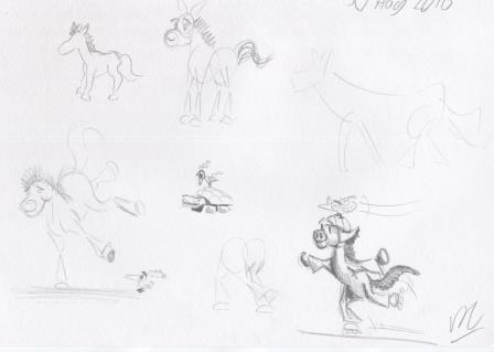 As you can see, some fun was had in this experimental stage. 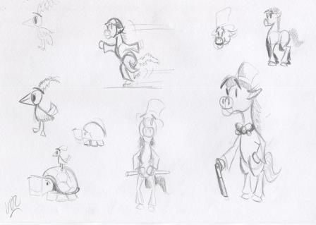 But I gave up on the horse, and became more serious about the turtle. The following sketches had inspiration from photographs of turtles I found online. 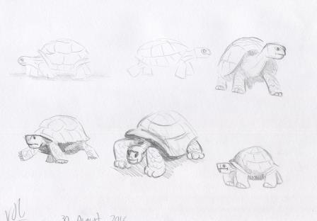 Then I played around with turtle ideas. 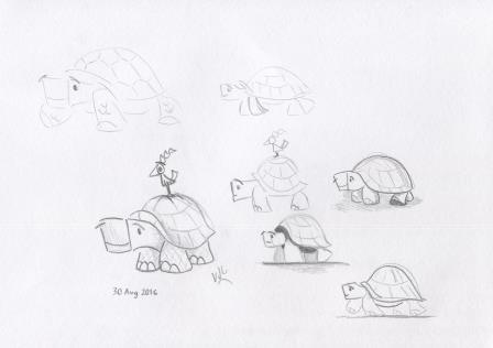 This is the pencil outline I came up with, to begin building the final artwork. 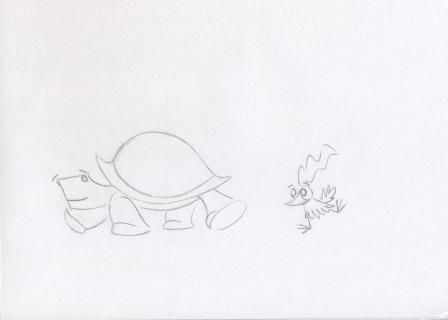 When I photocopied it, and got the coloured pencils out to do a colour test - and to some extent a texture test, it got thumbs up from the family. 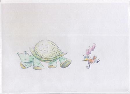 The plan I had was to do some light watercolour washes, and then add coloured pencil. 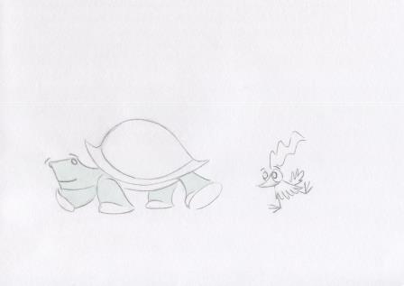 The paper buckled more than I thought it would, but I knew Photoshop could take care of that. 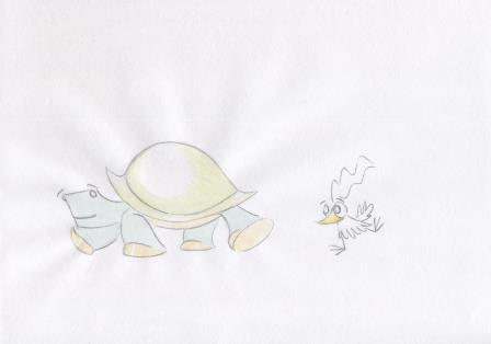 Here's how it looked with the watercolour before adding the coloured pencil work. 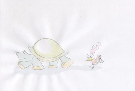 This image is about halfway through the coloured pencil work. 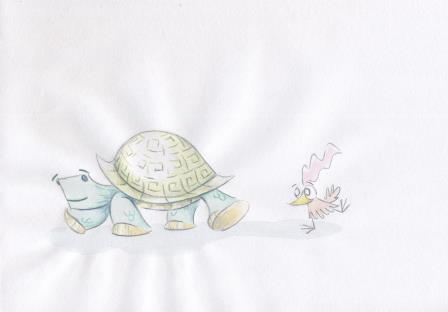 And this is as far as I went with the coloured pencils, before scanning it onto the computer to complete it. 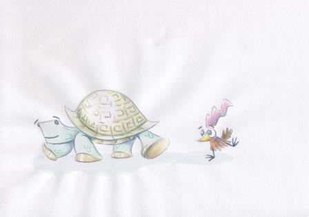 And here's my turtle and bird, finished. 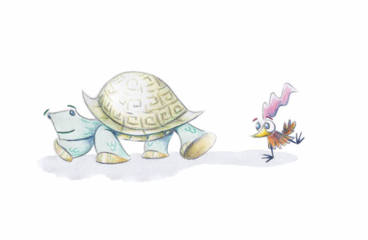 It is a long way from the horses I started with, but I'm happy with it.
I am closer to submitting the third set of artworks for assessment to the London Art College's correspondence course D6 Illustrating Children's Books. Of the set, the second part is a bigger project, is a vignette of a young dragon who has yet to control his fiery breath. The brief went something like this: Capture Fred's look of baffled horror as he sets fire to a thatched cottage roof. Audience is for fairly young children, but will also appeal to older children if enough humour is present. Use very bright colours, loose paint work, and thick black line work. Use portrait orientation and despite the chaos make it easy for a child to decode what is happening in the illustration. So the first step was a few practice sketches to work out what Fred should look like: 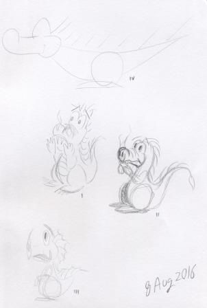 And a practice go at the composition of the image, especially the relationship between the dragon and the cottage: 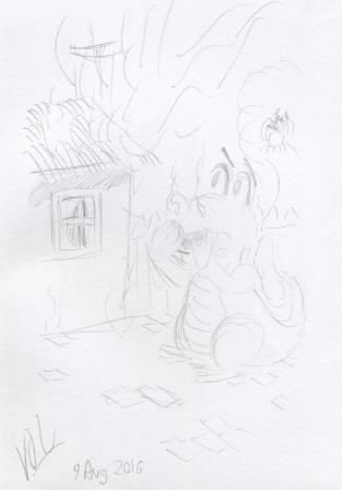 Here is the pencil outline for the vignette: 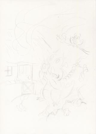 And some of the initial washes, starting with our friend Fred: 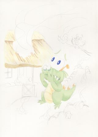 Some more washes along, and the vignette shape can be seen, and the background is taking shape: 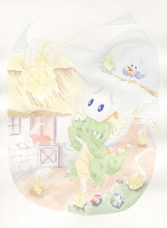 Now to add in some more layers of colour and to intensify the fires poor Fred has lit: 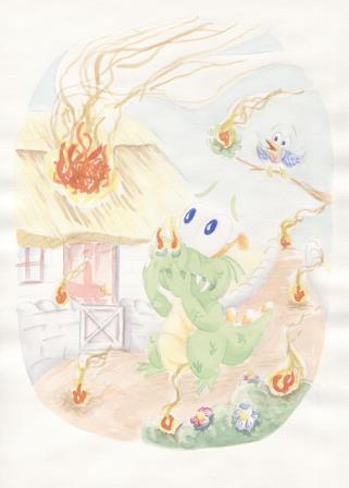 The next thing is to add the thick soft pencil, while somehow keeping it both loose and bold: 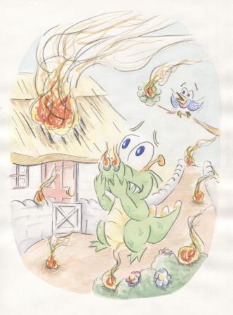 The last step is doing some clean-up with Photoshop: 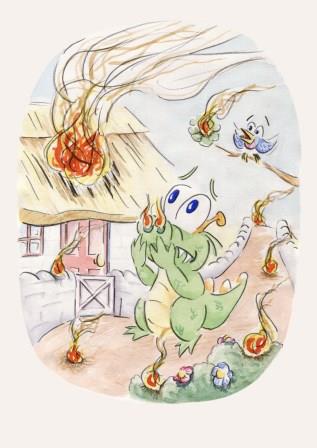 And Fiery Fred is done. Just like the first part of this unit, using this method of building up a picture is well outside my comfort zone. I'm far more comfortable using pen ink for the backbone of the image instead of watercolour.
I am getting close to submitting the third set of artworks for assessment to the London Art College's correspondence course D6 Illustrating Children's Books. Of the set, the first part is a smaller project, outline drawings of animals doing silly things. The brief went something like this: Make 3 or 4 loose bold outline drawings of animals doing silly things. Use bold and simple shapes. Draw with thick, soft pencil or crayon, and use a different primary colour for each animal. Add a contrasting colour for interest. When dry add more line detail. Keep your audience of young children in mind. This exercise was well outside my comfort zone, because I love using close ink detail and loose work does not come naturally. Here are the initial ideas I had, in my usual style: 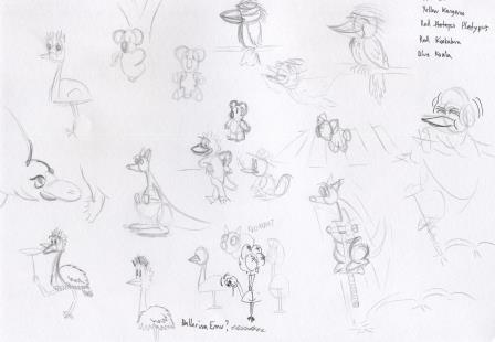 I had to go much larger, and with thicker pencil. You can see here my pencil tests and the development of the horse, kangaroo and kookaburra ideas. 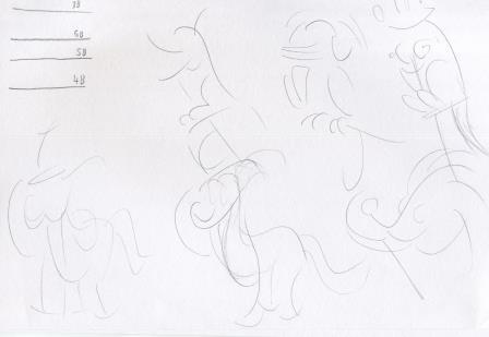 The next sketches explore the dancing bird and the kookaburra further: 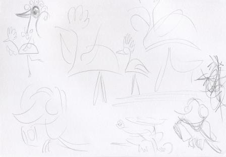 And some more ideas, with the emu, kangaroo, horse, echidna and kookaburra. 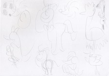 The next step was to give it a go on good cartridge paper. Here's a progress scan. We have the horse with the top hat, (blue with orange contrast); the dancing bird/emu, (yellow with purple contrast) and the kookaburra listening to music (red with green contrast). 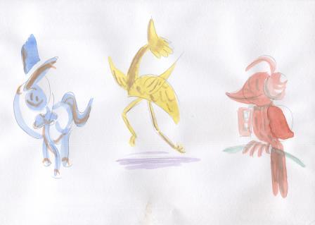 Now to add the extra pencil detail. 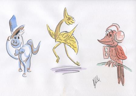 I didn't want to go further and ruin them, so I decided not to redo them on heavier paper. But I did try to clean them up with Photoshop. 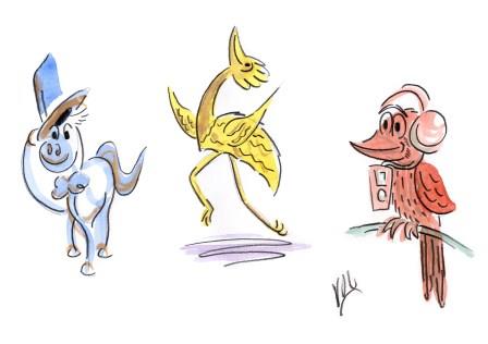 I think I am happy with the final result. The more I look at them, the happier I get. So I decided to explore the thick pencil style a bit further and used it for my Father's Day picture. Firstly, here's the pencil sketch: 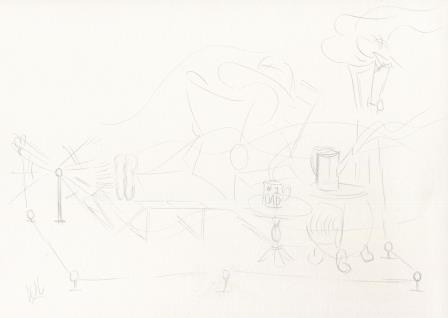 And trying 'to keep it loose', here's the first wash. 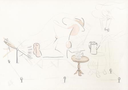 Another set of washes, and the image will get clearer: 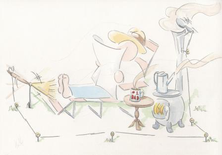 And adding in some more line work, and a bit more colour detail: 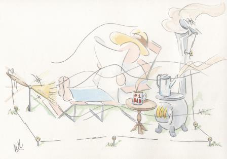 With the final touches in Photoshop, it is now ready to go on this year's batch of Father's Day cards. 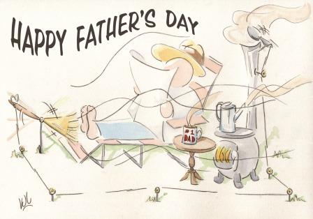 So all in all, a very interesting exercise/project, despite all my initial misgivings.
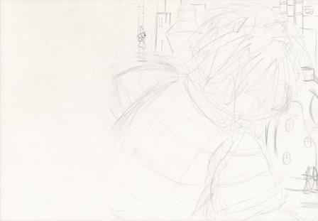
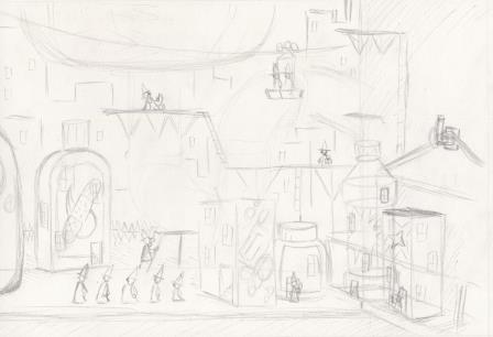
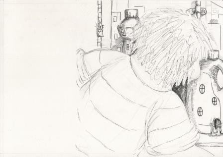
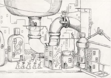
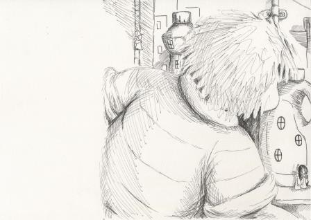
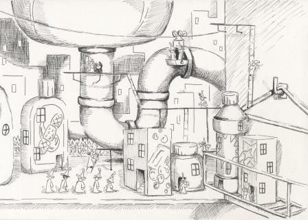
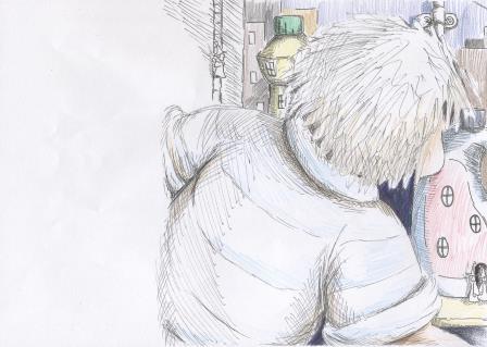
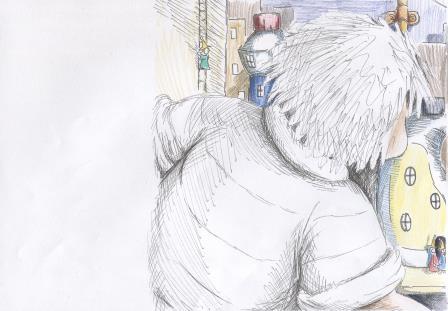
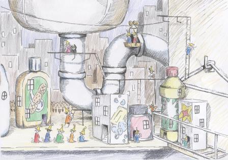
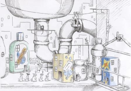
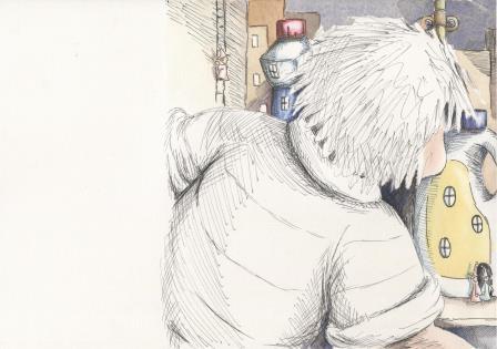
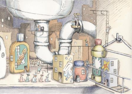
I am just about ready to submit the second set of artworks for assessment to the London Art College's correspondence course D6 Illustrating Children's Books. Of the set, the second part is a major project, a double page spread. The brief went something like this: Allow for a text area taking up about 1/3 of the left hand page. Sebastian is seen to either build or find an imaginary world under the kitchen sink. Make it detailed with a cartoony edge, and use good contrasts of scale. Allow a 30mm border between the trimmed edge of the page and the start of the text. The text was not supplied. Here's the layout idea from my sketchbook:  And my pencil roughs:
The next part was to add the ink.
And then add a bit more ink, increasing the lights and darks and adding more detail.
Next I took some photocopies, and used coloured pencils to test my colour arrangement ideas.
It seemed like having minimum colour on Sebastian made for a better flow from text area to city, and made the city the feature of the double page spread. Now to begin the watercolour work. Masking fluid first. For this part it was easier to take photos rather than scans. I started with the browns and beiges. 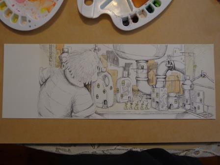 Then came some blues and greens. 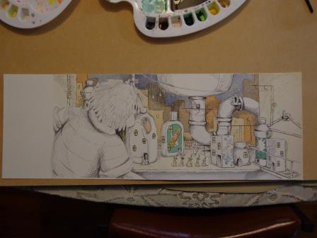 Followed by yellows and reds. 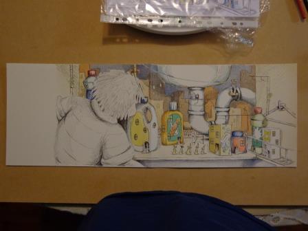 Then some skin tones on Sebastian, and fine tonal detail. The little people still need colour. 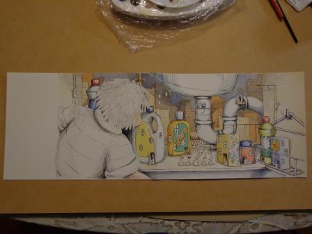 Here's the final raw artwork, with the bleed area still present.
Now to stitch it together with Photoshop and remove a few minor blemishes. 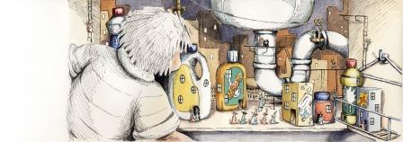 And what it would look like with the 5mm bleed removed, in a picture book. 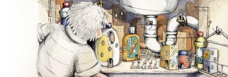 And lastly, how a bit of text would look. 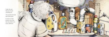 I'm very pleased that this project is finished. I enjoyed it, but it took a lot of work to complete.
Usually in late April my Mum reminds me that we need a new artwork to go on our Mother's Day cards for our female relatives. Here is what I came up with for 2016. 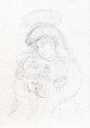 Firstly a rough pencil sketch. 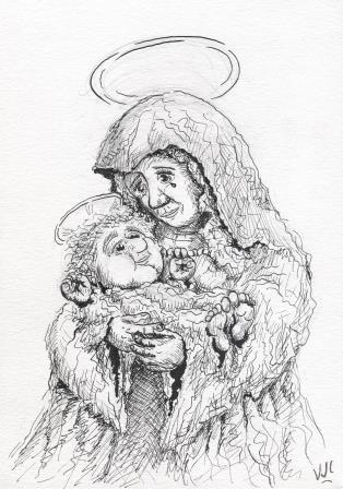 Then comes the ink. For this picture I used nib ink rather than my usual felt tip ink. This scan was before I rubbed out the underlying pencil marks. 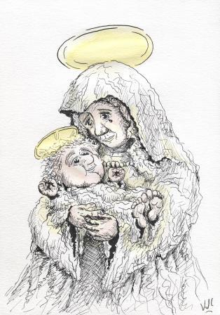 Now to add a bit of colour. Firstly initial washes of gold and a little skin tone. 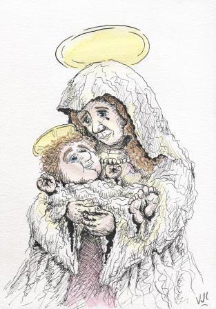 Then hair and shadow areas. At this point I was in two minds whether to add the expected blue or not. The need for a bit more contrast between mother and child tipped the balance. 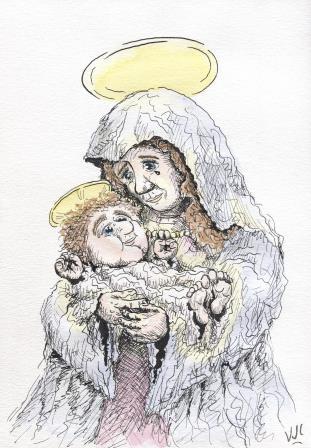 Light pinks don't tend to scan very well, sadly. But I am happy with the final result, and so was Mum, my Aunts and Grandmothers. I'm hoping our heavenly Mother was happy with it too.
Since January I have been working through the London Art College's correspondence course D6 Illustrating Children's Books, and I am just about ready to submit my first artworks for assessment. For each assessment, 2 artworks are submitted. This second one was the bigger project. The brief was to prepare a double page spread (equivalent of 2 landscape sheets of A4 with a 5mm bleed allowance) containing the text to the nursery rhyme 'Row Your Boat'. The text had to go along the bottom of the two pages, and to have a pale background. The artwork had to be simple and bold, and suitable for a 2-4 year old child and for the adult reading the story. It had to be dreamlike, but without being scary or nightmarish. Any characters, human or animal, have to be engaging to a small child. Firstly I sketched an idea or two into my visual diary, to see if it would work. Then I re-drew it in pencil, with modifications, onto 1/4 size to get the layout and spacing going in the right direction: 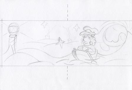 Then I inked that sketch, and added a few notes to myself as reminders for when I drew the full size picture. 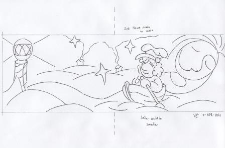 The next step was to photocopy the drawings and to test some colour ideas with coloured pencils, and also whether I should use ink or not on the final artwork. 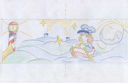 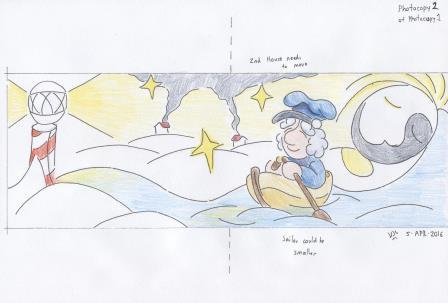 I decided against the ink, thinking it would detract from the dreamlike quality desired. Here's the full size artwork, after the masking fluid had been applied. The little duck is new, and the gutter area is now free of important elements. 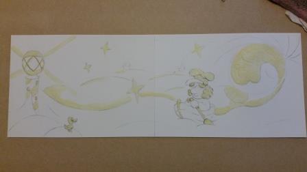 Now for some initial colour washes. 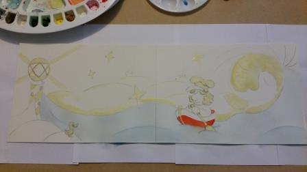 Some work on the background, the pole that doubles as both bed-post and lighthouse, and a bit more work on the rower. 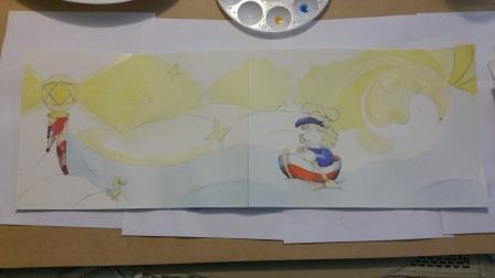 Time for some work on the middle-ground: 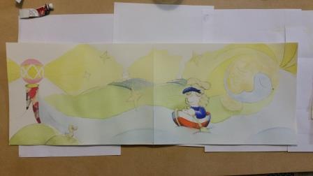 Now for skin tone on the rower, the blue houses and more work on the bed-post/lighthouse: 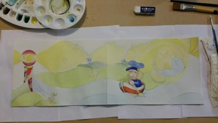 Here the little duck now has some colour, and it is almost time to remove the masking fluid, and start the flattening process: 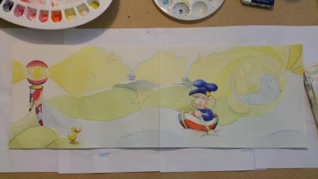 Here's the raw scan of the left hand page 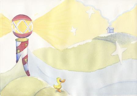 And the raw scan of the right hand page 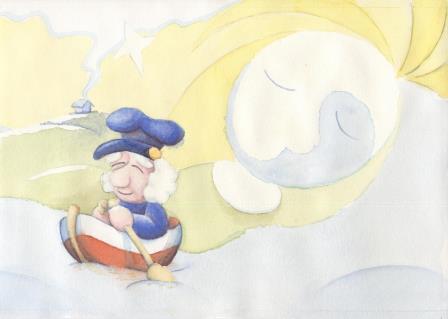 From here a lot of work went into fixing up minor blemishes in Photoshop and merging the join together. Then the artwork went into InDesign to add the text, the font Angillian regular seemed to be just right. Here's the final artwork with the bleed still showing: 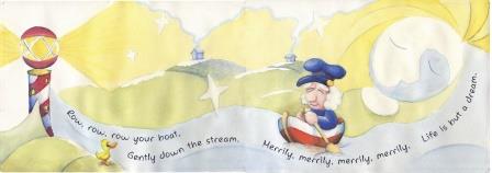 And as it might look in a finished book without the bleed. 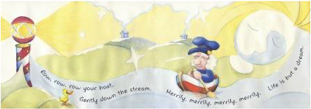 I'm more comfortable working at A4 size, so this project was a bit outside my comfort zone. Thinking about a pre-school audience was outside my comfort zone too. Now that this project is finished I'm looking forward to the next segment of the course.
|
News and Other StuffAbout recent artwork, inspirations and other things I find interesting. Archives
April 2024
Categories
All
|
 RSS Feed
All artwork and images on this website (unless stated otherwise) are the property of Vincent Cavanagh and cannot be used without his permission.
|
Social Links
|
Proudly powered by Weebly
|