|
The good news is that I made it, completing an image every week according to the #illo52weeks themes for 2017 as well as the bonus Christmas image - and each one was done within the weekly time frame. The not so good news is that there's lots of doubt over whether the Challenge will take place in 2018 - although a list of themes for 2018 has been released. So here's my work for weekly themes 48 through to 52... Week 48 was Africa. For this one I used ink only and a photographic reference of an animal from Southern African called a gemsbok, which is a type of antelope. 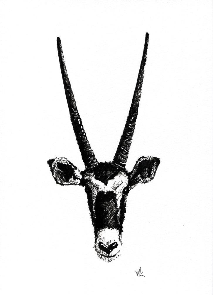 The theme for Week 49 was Purple, and as it was Advent, an Advent wreath seemed appropriate. 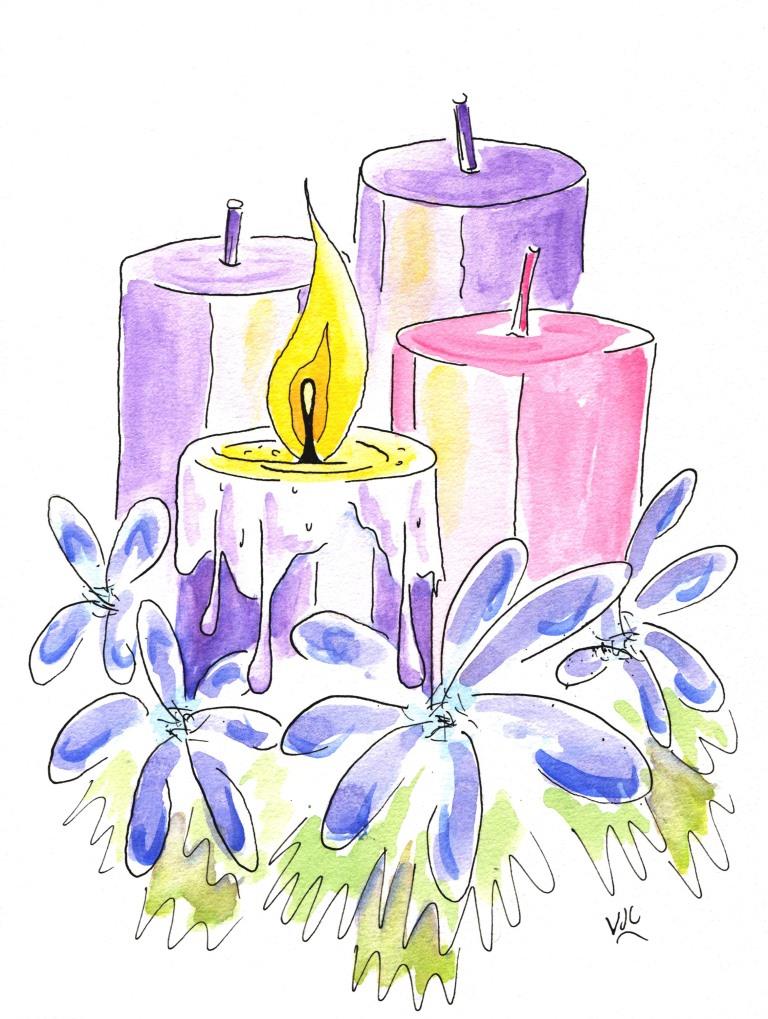 Week 50's theme was Window, and this one has echoes from a long running ABC-TV children's show that used windows to introduce adventures. 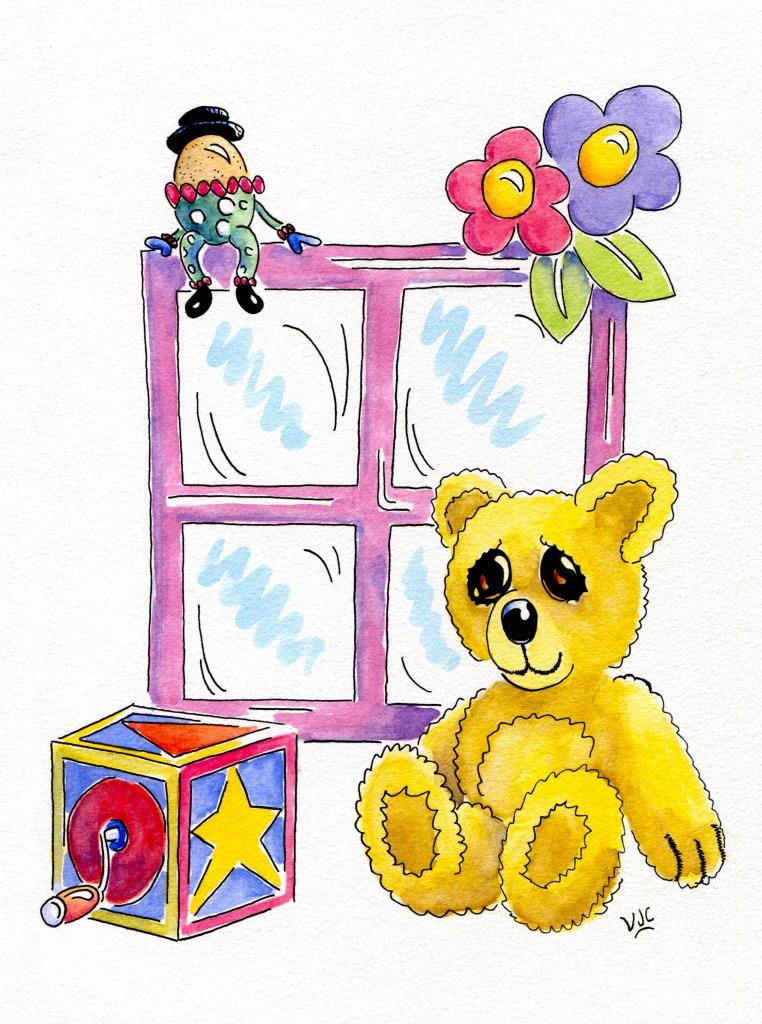 Shopping was the theme for Week 51, and I needed an idea that would make me smile. Maybe some of you will relate to one or other of the protagonists. 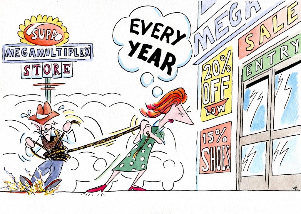 And for the lucky last for 2017, the theme was Celebration. Nothing quite beats the elation of welcoming a new member into the family. 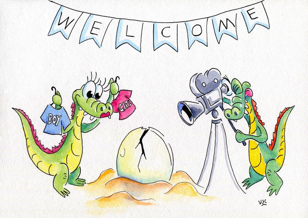 And that's a wrap for 2017.
2018 has begun, may it provide all of the open doors and opportunities that 2017 sadly lacked.
0 Comments
To tell you this story, you have to meet Suzanne first. Here she is, a well known local hairdresser. What's new is that she is now running her own salon, after being either an employee of another salon or doing home visits for many years. 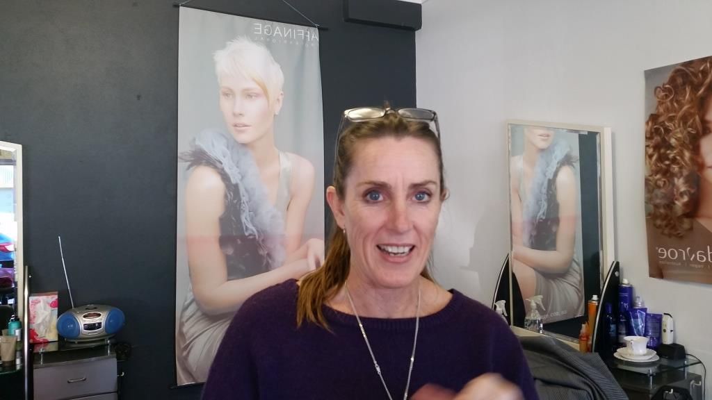 Here's her salon website page http://suzannessalon.weebly.com/ and the Facebook page https://www.facebook.com/SUZANNESSALON1/ (You will notice how very proud Suzanne and Louise are with the results of their hair colouring talents.) Anyhow, in her travels Suzanne saw this image (below) and had an idea. 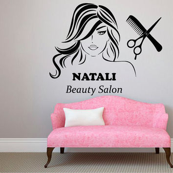 She wanted something like this on her salon wall too, so she asked me to do it. The first step was working on the computer and using Adobe Illustrator to produce an image that could then be reproduced freehand grid-by-grid. 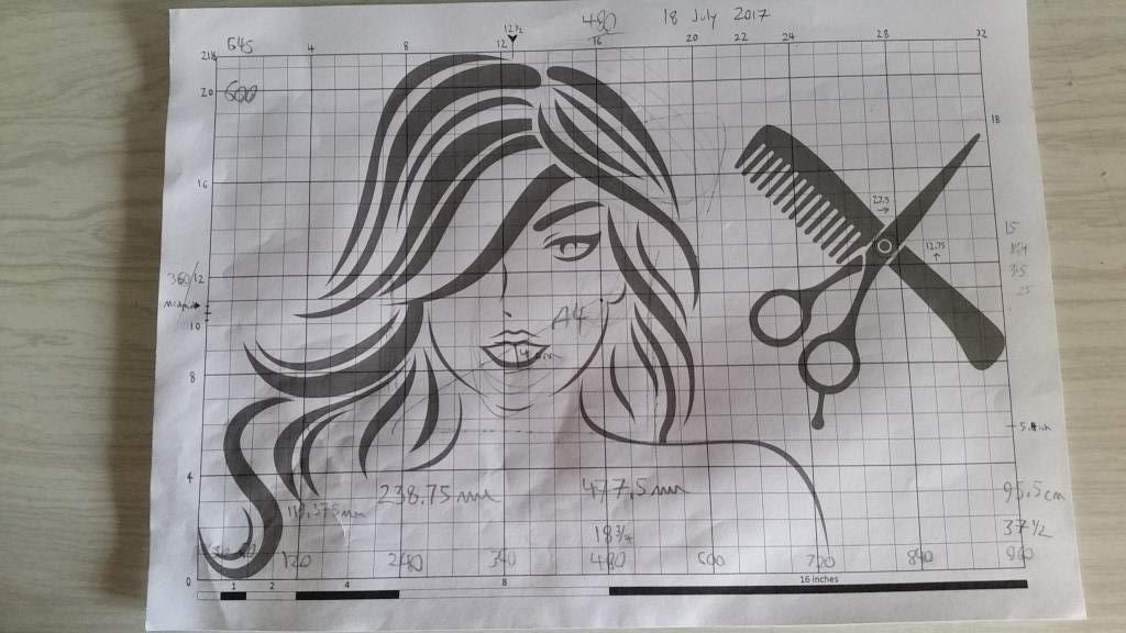 As you can see, this print out got a lot of use. Once Suzanne was happy with the size and placement on the wall, I got busy with a pencil, ruler and set squares to align the grid and then start the image. 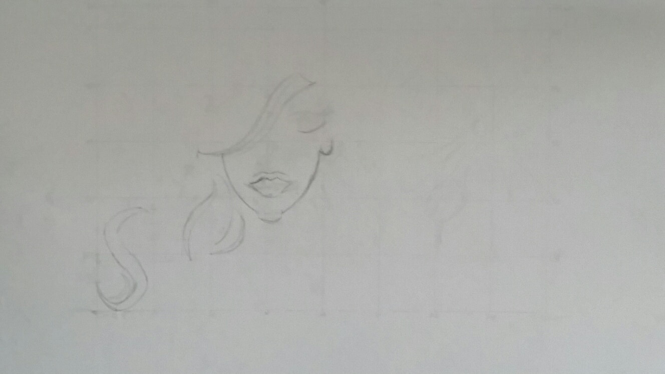 It gradually took shape... 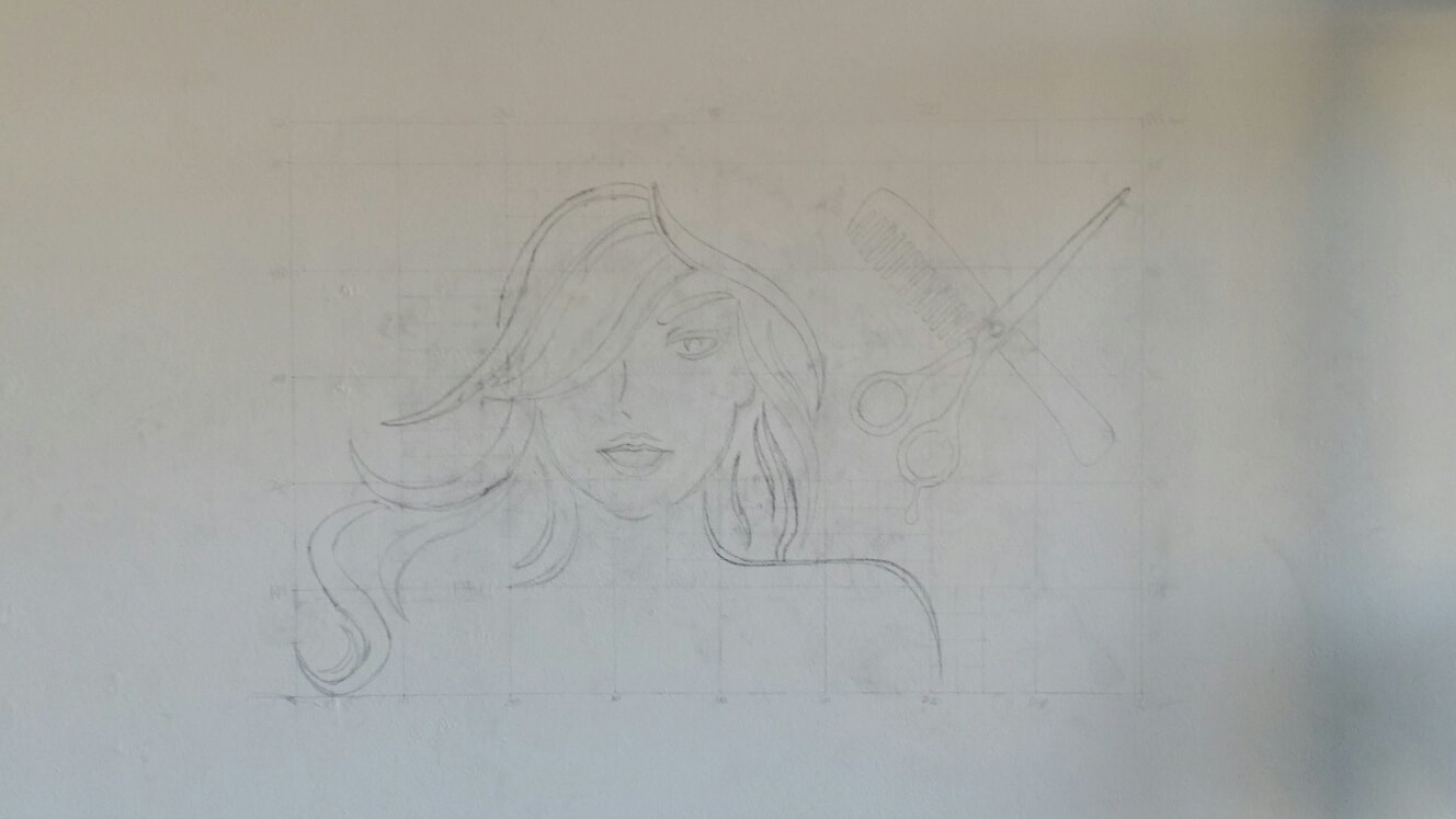 And looked a lot better once the no longer necessary grid lines were removed. Now onto the painting stage... 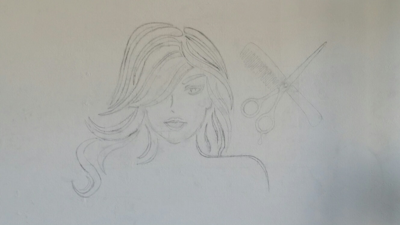 It was a different experience painting on a vertical surface rather than a horizontal one. To keep the edges and points as sharp as possible I made use of good quality masking tape. That's the blue masking tape you can see below. 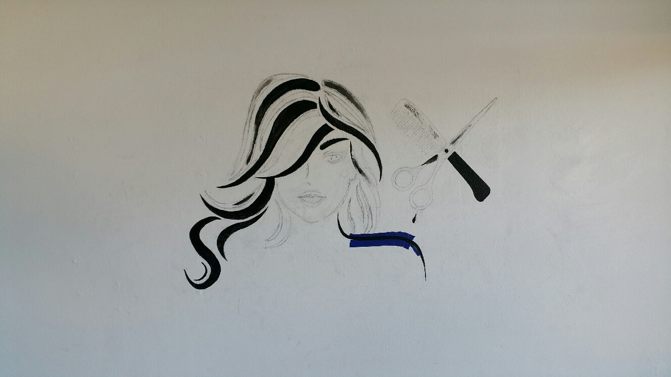 And here it is, finished but for the removal of a few pencil marks that will come off easily from the 'wash n wear' paint background. 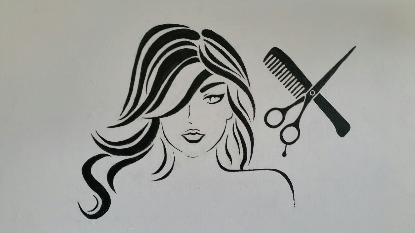 It was something completely different to what I normally do, and it feels good to have overcome all of the new challenges that came with it. Of course I'll see all the errors in it, and never be completely happy, (that's life as an artist), but hopefully Suzanne, Louise and their customers will enjoy it for many years to come.
Thanks Suzanne for trusting me with this project. Here's the #illo52weeks report from Week's 26 to 29: The theme for Week 26 was San Francisco, so I decided to go for the holy man himself and not the city. 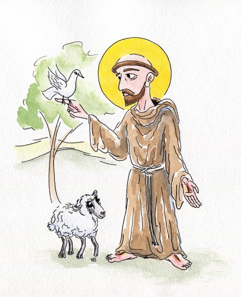 Week 27's theme was Bush Countryside and came straight from my imagination. For this one I decided to keep it Black & White and use some ink wash. 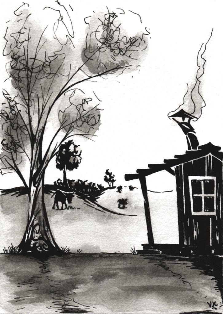 Week 28's theme was Growth, something that every child knows about: 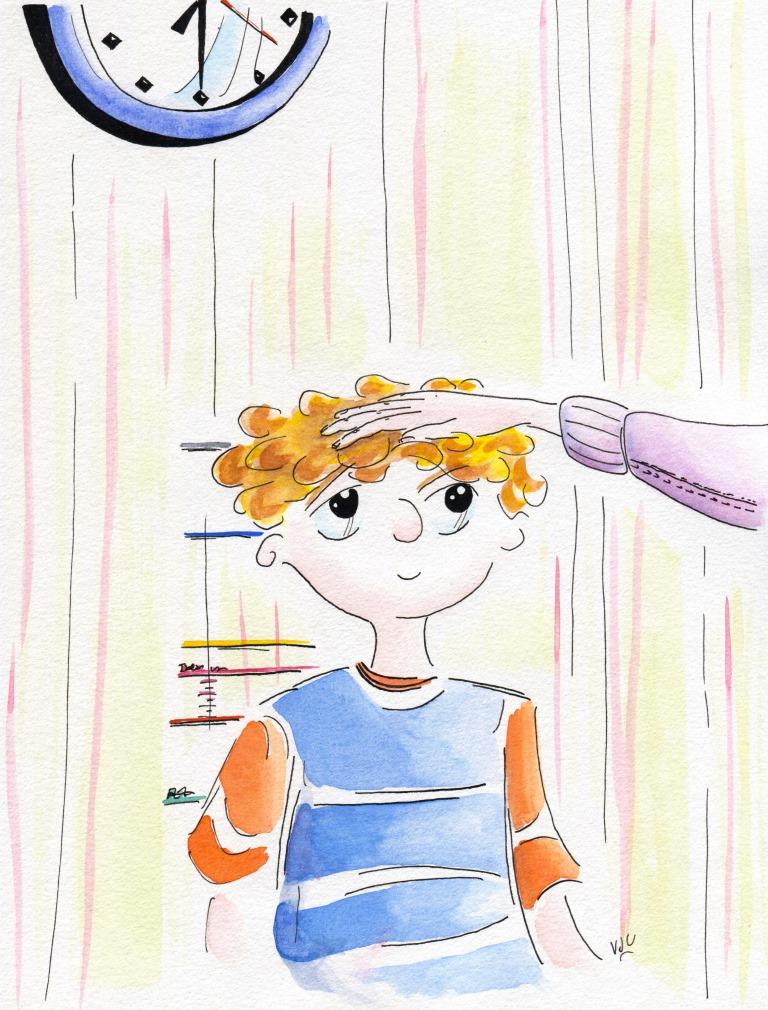 Week 29's theme was Swing. For this one I went for ink and ink wash again, with just a smidgen of colour: 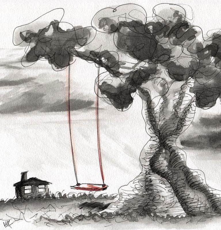 I am now a Facebook newbie, having had a page for just on 2 weeks.
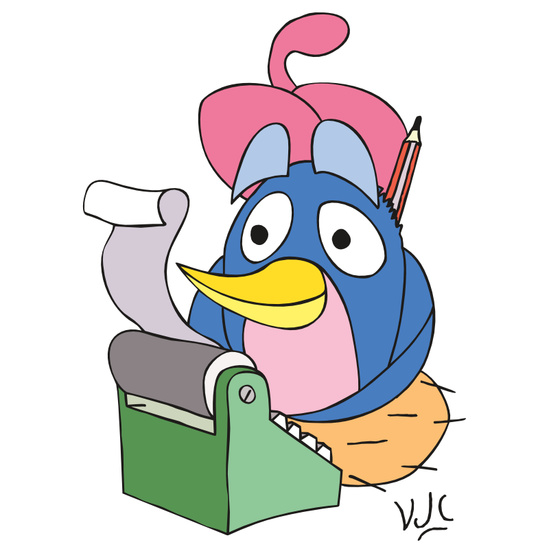
It was necessary for taking part in a short course with The Oatley Academy called 'First Flight'. Gradually I am getting through the hours and hours of podcasts and hopefully will get to the drawing part soon. This challenge for illustrators has been going for a few years, but this is the first time I am giving it a go. At the beginning of the year a list is posted online containing a list of weekly themes. http://illo52weeks.blogspot.com.au/search/label/2017%20themes Illustrators can then post their efforts for each weekly theme on social media with the #illo52weeks hashtag. Mine are getting posted to Twitter @VJCavanagh . So far I'm using different paper for this challenge, both in manufacturer and in size (170mm x 235mm), and I've been using nib ink too. Week 1's theme was Whimsy. Here is the ink only version:  And the coloured one  Week 2's theme was Feathered Animals.  And here's the difference colour makes... 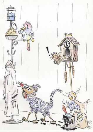 Week 3's theme was Australiana (in time for Australia Day on 26 January) 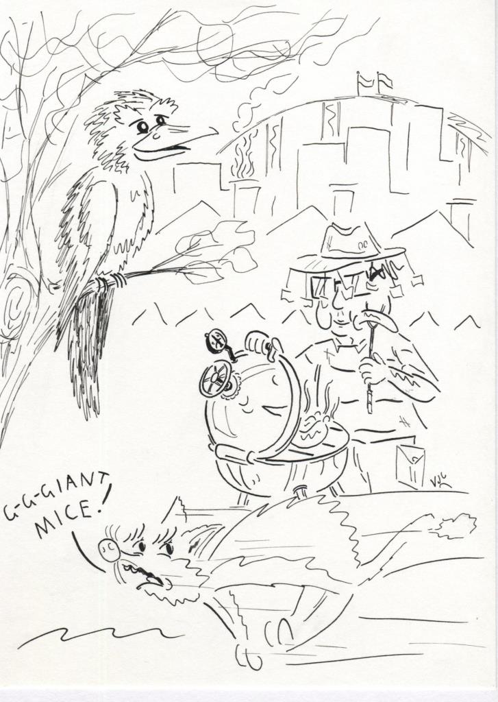 And let's add some colour... 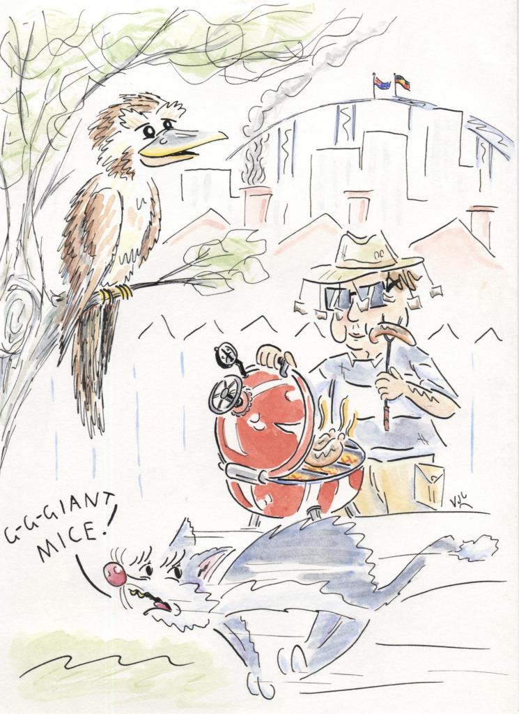 So far the challenge has been fun. It is a pleasant change to have such an open ended brief to work with. Should I remember, I'll go for medium compression rather than full compression from here on in with this size paper because the full compression isn't giving a good online image.
Week 4 is an Ode to a favourite children's book....however I haven't yet decided what my favourite children's book is yet. Continuing the fifth set of artworks for assessment to the London Art College's correspondence course D6 Illustrating Children's Books: Of the set, the second part is a much bigger project, which was also exercise in black and white work, to be inspired by the text of a creepy poem. The brief went something like this: The image should be suitable for 5-7 year olds. Make it portrait orientation. The given poem should be in the centre, with the illustration forming a border around it. Give it a white border, no bleed, and use 18cm wide and 25cm tall, with the poem to sit in an area of 8cm wide and 14cm tall. Balancing the black and white is important, as is creating a creepy feeling. Use the images evoked by the text, but don't be limited to them. The first part was getting the layout right, and that meant using InDesign and doing some research on how to display a poem where the first line is also the title. Accordingly the first line was in bold with a stanza-sized gap to the second line. Then I needed to try out some ideas for the illustrated border. So I printed out a few templates and started sketching. With the first one I tried for a Phantom of the Opera style character, but ditched that idea. 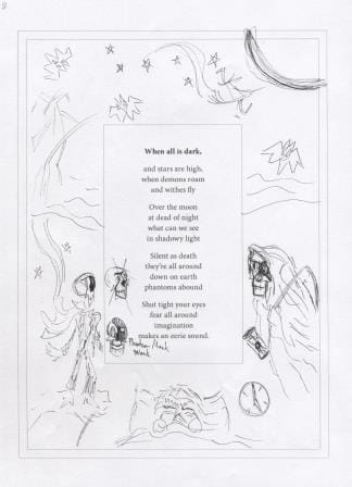 The outer parallel line shows the trimmed paper size and the inner parallel line shows the white border. The next sketch developed the grim reaper and the moon further. 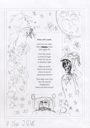 Too many bats didn't create enough interest, so I looked into ghostly options and refined the witch a bit. 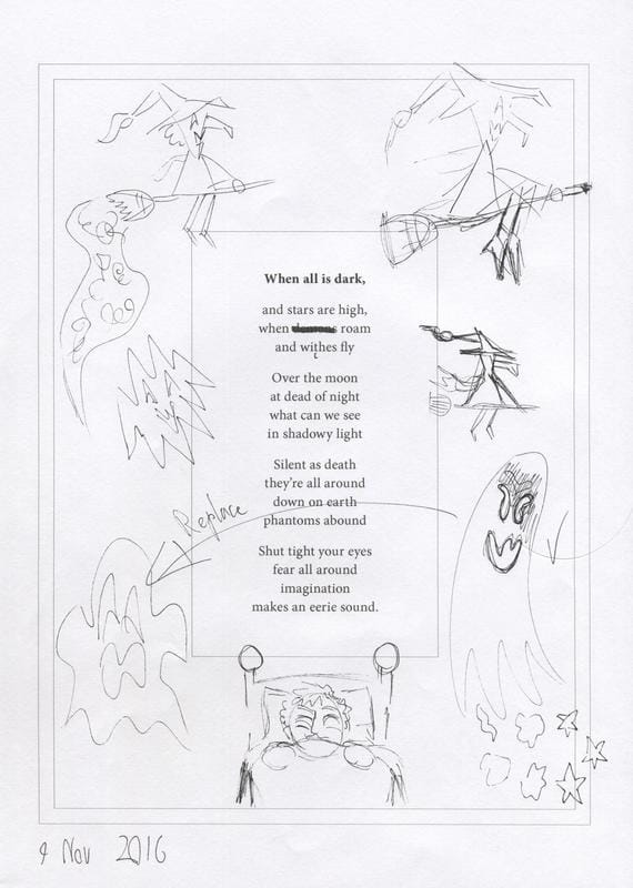 Now to get out the good paper and begin: This is how it looked around halfway through. Again I needed to use nib ink to get the black as consistent as possible. 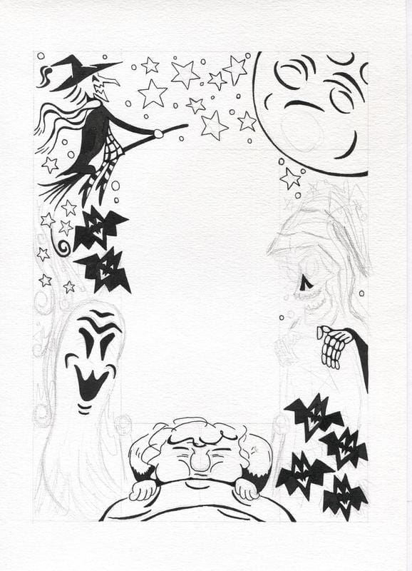 And here's what the illustration border looked like before it got cleaned up in Photoshop: Getting the balance of white and black required more work on the stars at the top of the page. 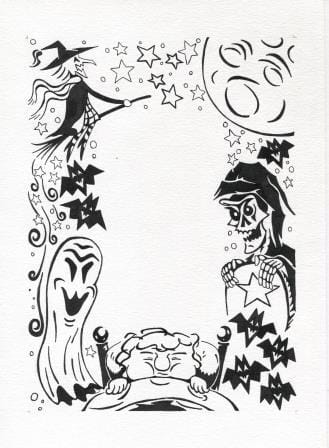 And what it looked like after the Photoshop work: I've added a hairline border using the blog tools, so that you can see that there is a few mm of white border between the illustration and edge of the trimmed page. It is easiest to see under the boy and beside the grim reaper. 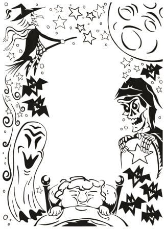 And now to add in the pre-prepared text, without the spelling mistakes. 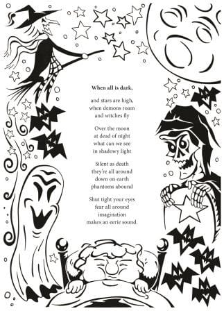 The thin white border is still there, it is just hard to see on a white background.
Creepy work like this rarely features in my visual diary! With Unit 5 done, it is time to start working on the 6th and final set of projects for this course. Now for the fifth set of artworks for assessment to the London Art College's correspondence course D6 Illustrating Children's Books. Of the set, the first part is a smaller project, which was an exercise in black and white work, with a creepy Halloween vibe. The brief went something like this: Take a vertical sheet of A4 paper and leave the middle third of it blank. On the left hand side use more white on black and on the right hand side use more black on white. Shapes on each side should complement but not repeat each other, because this is to be an illustration foremost and not a pattern. Everything starts with a sketch. So here is the initial idea in pencil. 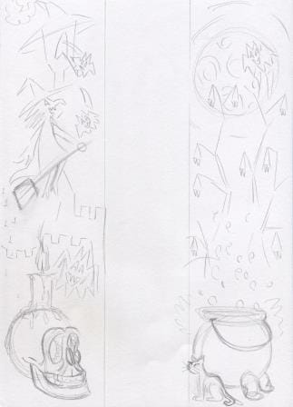 That idea got refined a bit, and tested to see how it would go 'black and white' wise with black watercolour. 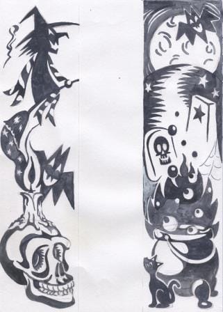 Trying to work white on black, and then black on white, is guaranteed to make your head spin. I wasn't happy with how some of the elements were working together, so I did another test page to see if I could make the witch's scarf and broom better on one side and the cauldron on the other side. From these tests, it was clear that in order to get consistent black and white contrast, I was going to need to use nib ink. 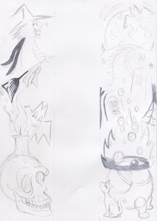 It was now time to start the final art. Here is the initial pencil stage. 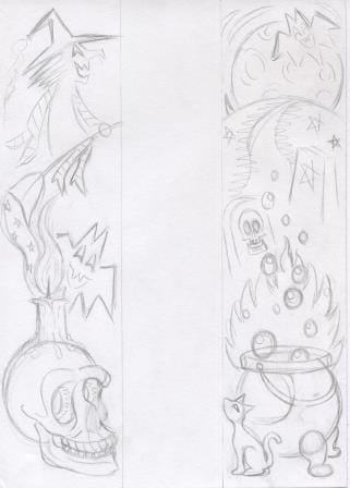 And how it looked after the nib ink was done. It was going to have to go into Photoshop to clean out the pencil marks, and to adjust the area where the candle flame and the broom exhaust meet, and to add whiskers to the cat. 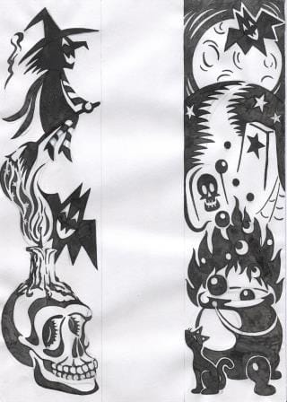 The whole Photoshop cleaning process took longer than doing the slow nib ink work, but it was well worth doing to get this result. 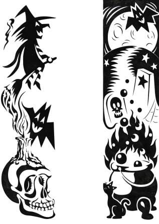 This was a challenging exercise to do. I enjoyed the challenge, but I'd have to have either a really clear idea or simpler shapes to consider doing something similar in the future.
|
News and Other StuffAbout recent artwork, inspirations and other things I find interesting. Archives
April 2024
Categories
All
|
 RSS Feed
All artwork and images on this website (unless stated otherwise) are the property of Vincent Cavanagh and cannot be used without his permission.
|
Social Links
|
Proudly powered by Weebly
|